Feeting Room
Service re-design
Summary
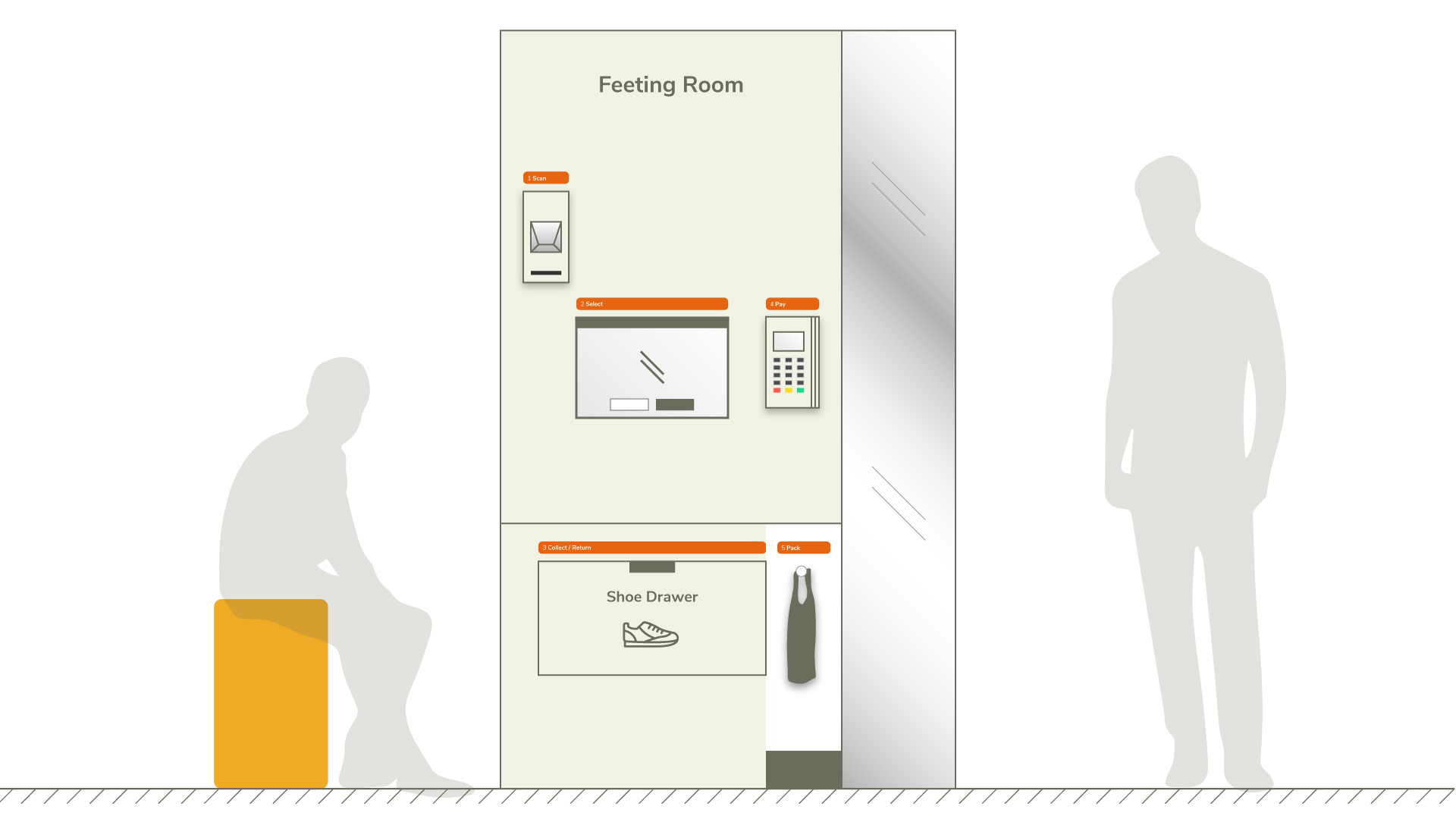
Feeting Room is a self-service shoe shop that redesigns the shopping experience, from browsing to fitting and checkout.
Try PrototypeTeam
Rina Chai
Shu Ying
Duration
2 Weeks
My Role
User Research
Prototyping
User Testing
Tools
Figma
Illustrator
Google Forms
The Challenge
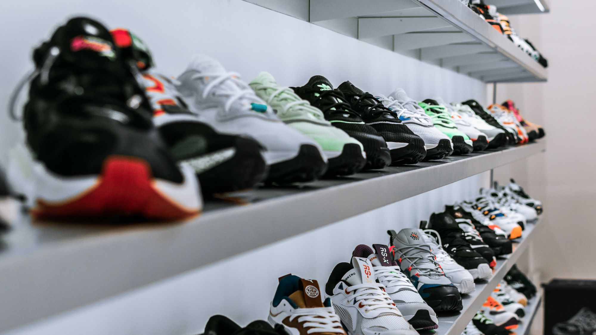
The growing demand and investments for the Global Footwear Market is a challenge to keep the in-store shopping experience relevant. A service redesign with new technology would improve the relevance in the shoe shopping experience.
Source: Unsplash
The Discovery
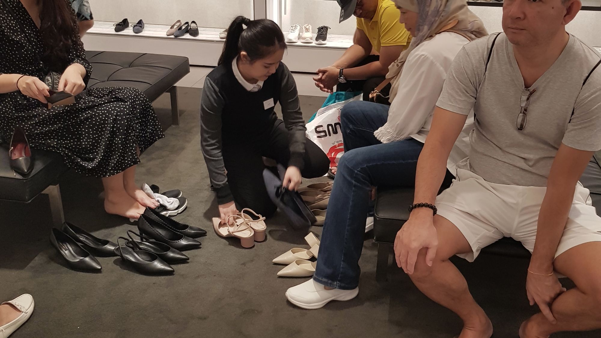
We observed customers at 4 shoe stores to understand their shopping behaviours and pain points. We then interviewed 6 participants who have shopped for shoes online/offline to validate our observations and understand the end-to-end shoe shopping experience.
- What are the motivations for buying shoes?
- What are some considerations when buying shoes? How do people prioritize the different considerations?
- What are the frustrations and difficulties when buying in-store/online?
We used affinity diagramming and the 5Es framework to synthesise our findings.
Space Issues
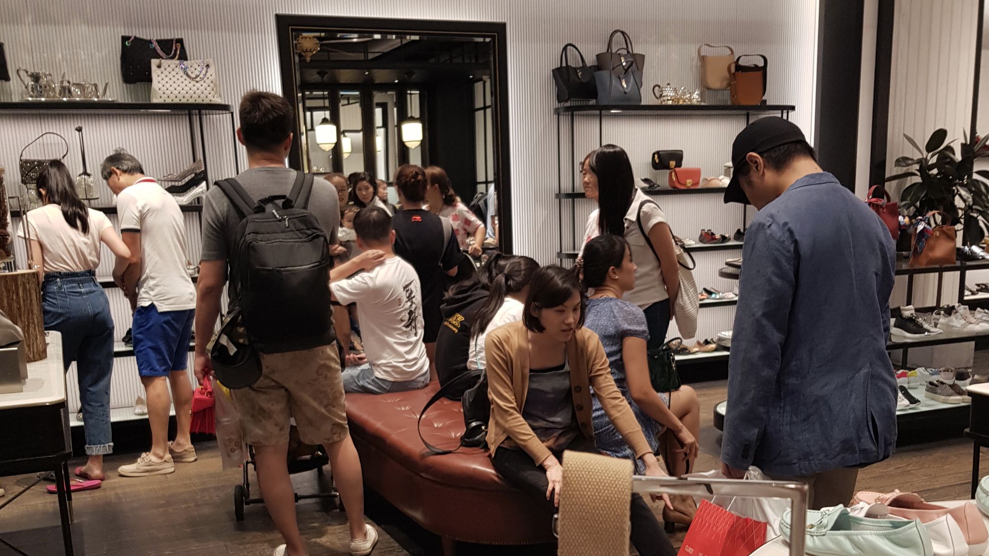
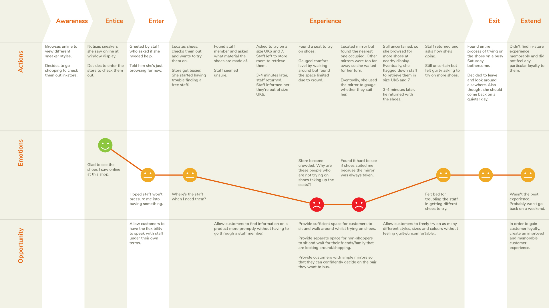
- Seating areas were crowded with shoppers and non-shoppers alike.
- Customers had difficulties using the mirrors due to overcrowded conditions.
Information-seeking Issue
- Customers expect staff to be knowledgeable about the products they stock.
Time Issues
- Customers had a lot of idle time waiting for staff to come back with their shoes.
- Staff had to make multiple trips to the stockroom to get sizes for different shoes for the same customer.
We were overwhelmed by the vast findings of the online and offline shoe shopping experience. Due to the limited time, we decided to prioritise on the in-store shopping experience and consider online as the next steps.
The Definition
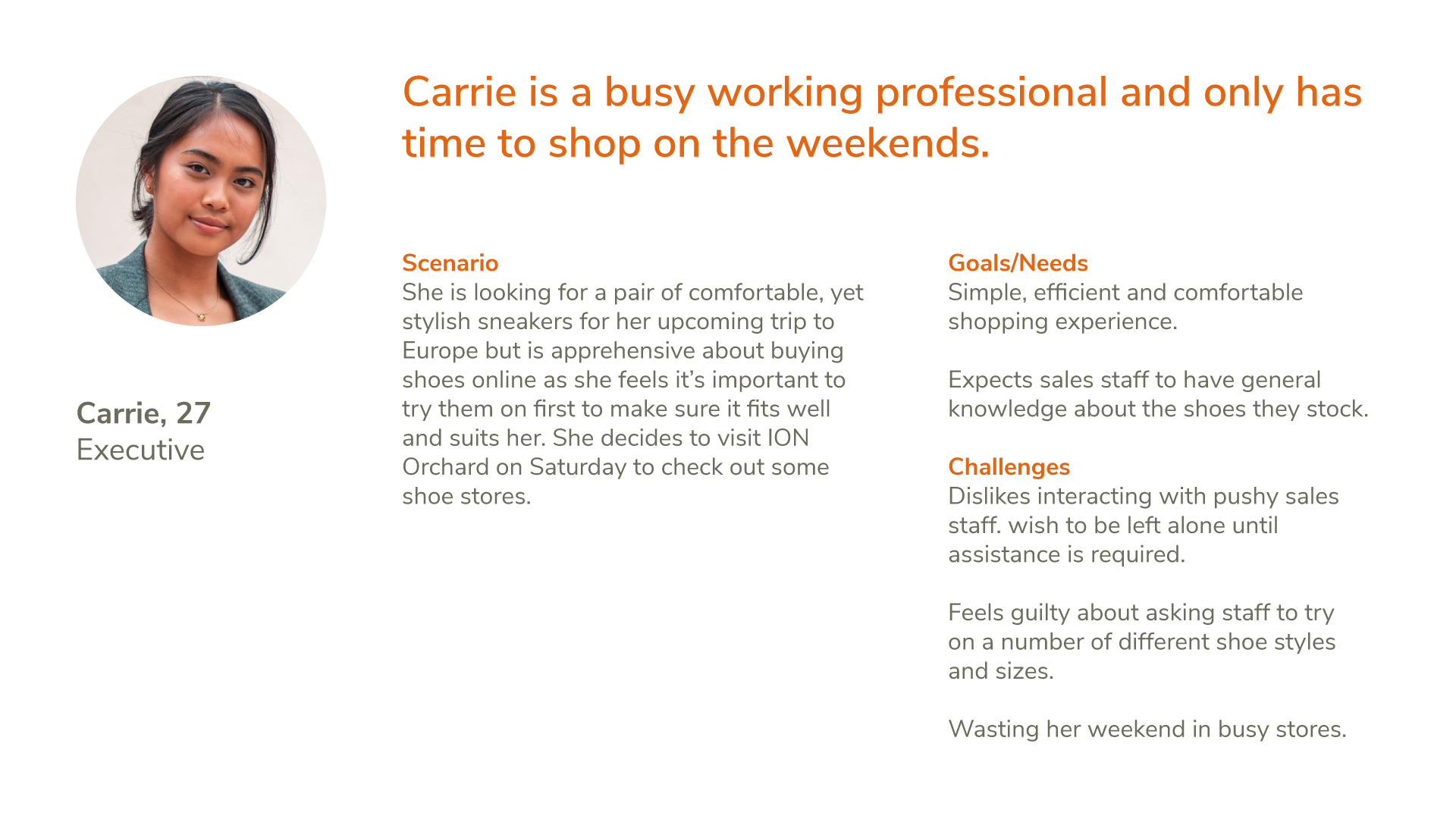
Following our findings, we created a persona and customer journey map to help us focus on our customer's ideal goals and challenges when shoe shopping.
Problem Statements
Suitable space, seating and mirrors
Carrie wants suitable facilities to try on her choices, but have difficulty locating available space, seating and mirrors especially during busy weekends.
More information
Carrie wants more information on shoes she’s considering, but does not enjoy interacting with staff, as they’re either too pushy, not available when needed, or not knowledgeable enough.
Worry-free fitting experience
Carrie needs a worry-free fitting experience to try different sizes, styles and colours but finds the process bothersome because she has to rely on the staff.
The Development
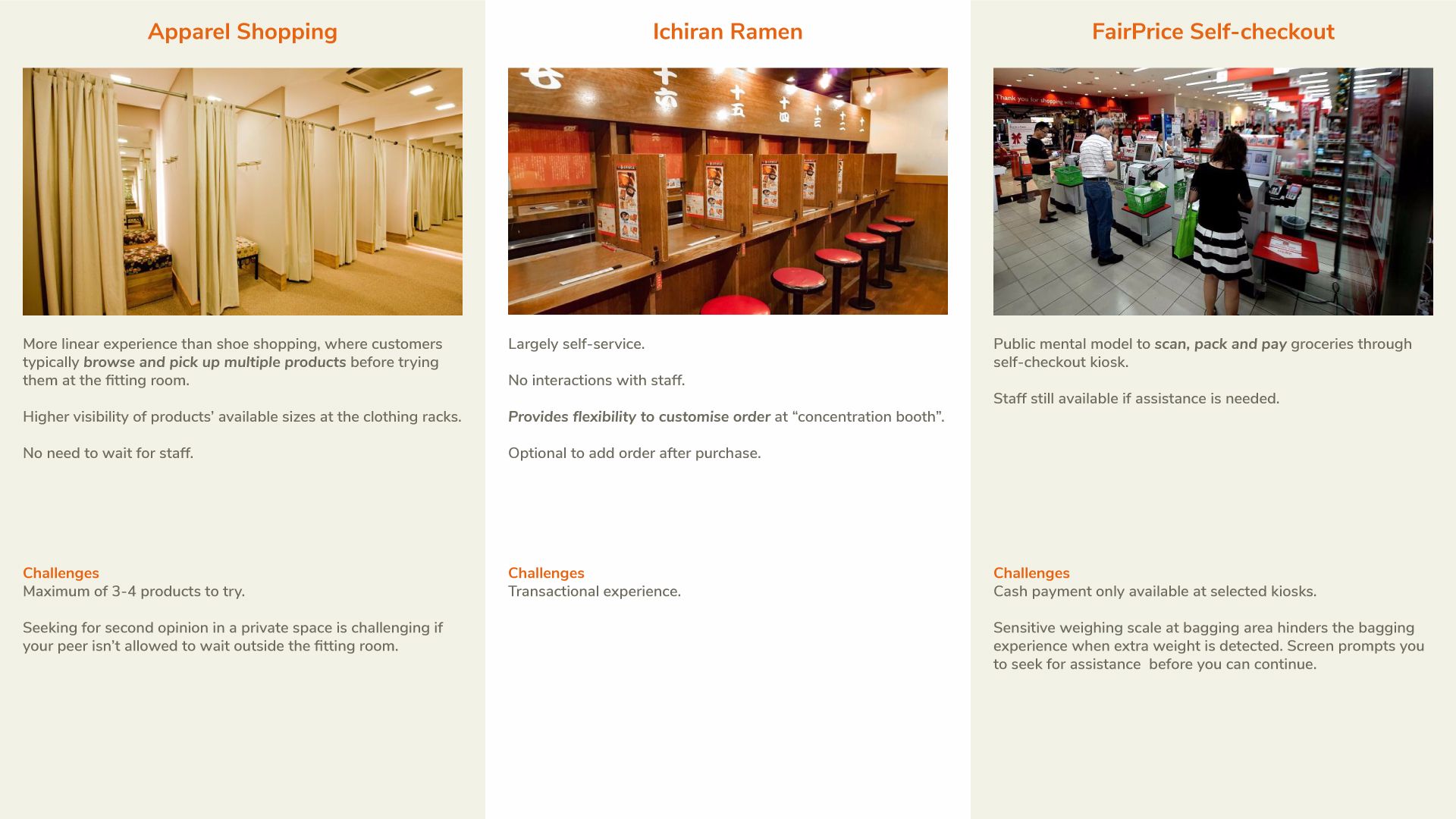
We conducted a comparative analysis to understand the similar methods across different services available in the market that Carrie would ideally need for her shopping experience.
Store layout rearranged
With the consideration of a self-service experience, we reviewed the store layout. Spaces were regrouped based on 3 shopping stages; Browsing, fitting and checkout.
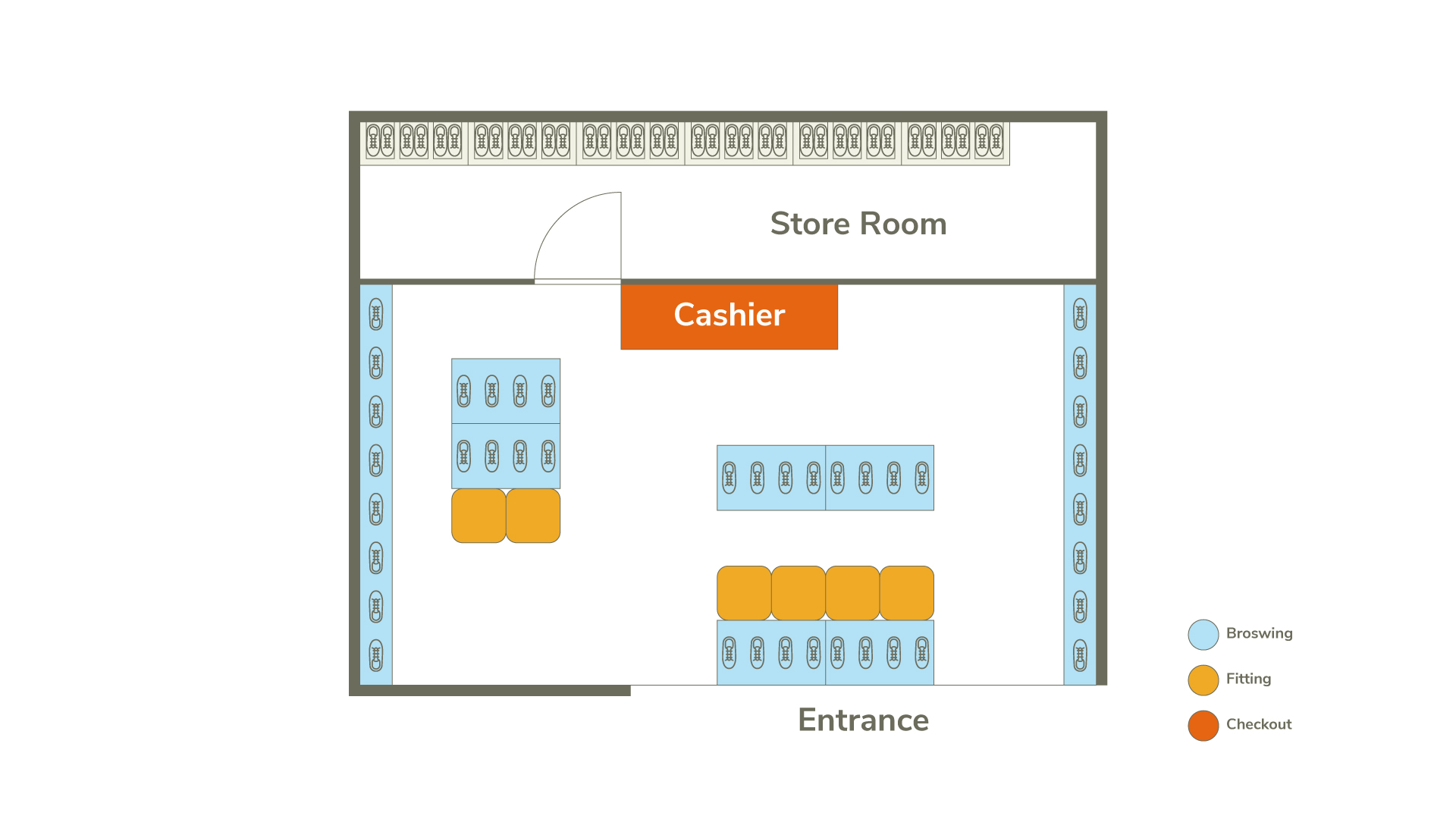
Current Store Blueprint
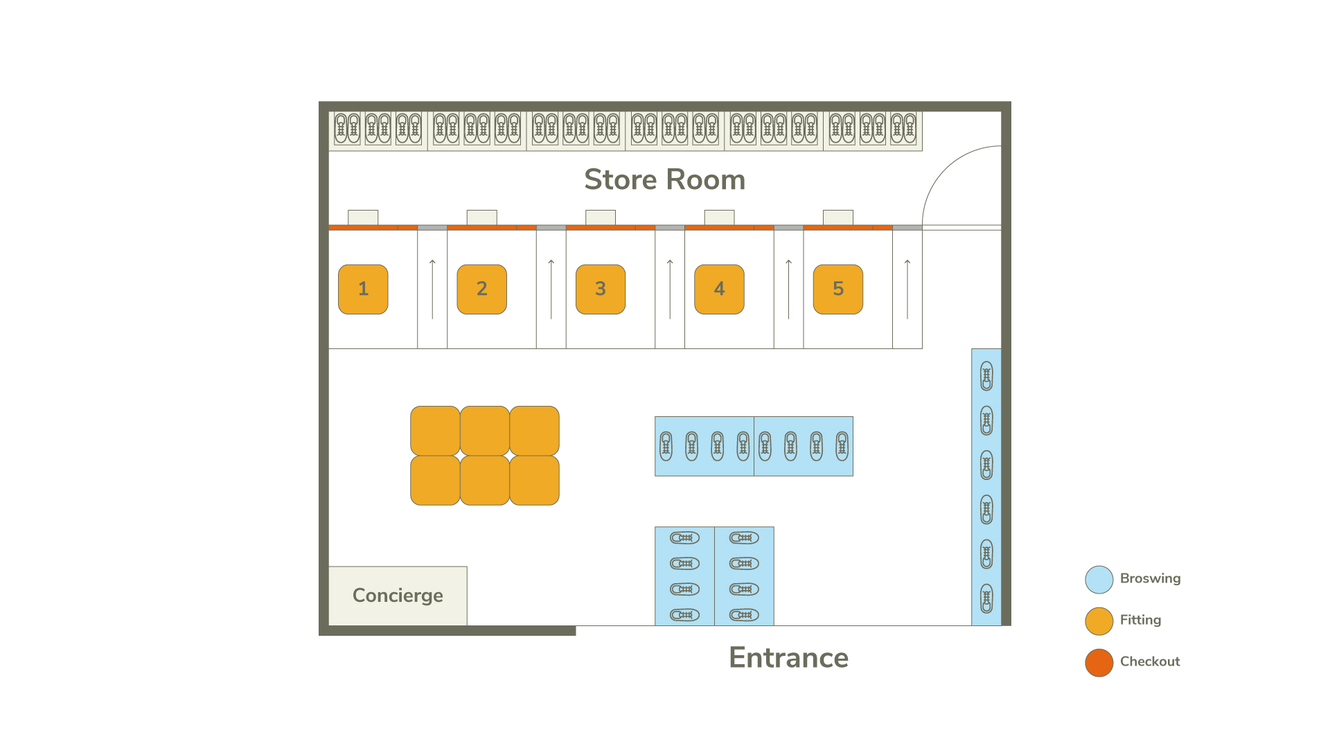
Proposed Store Blueprint
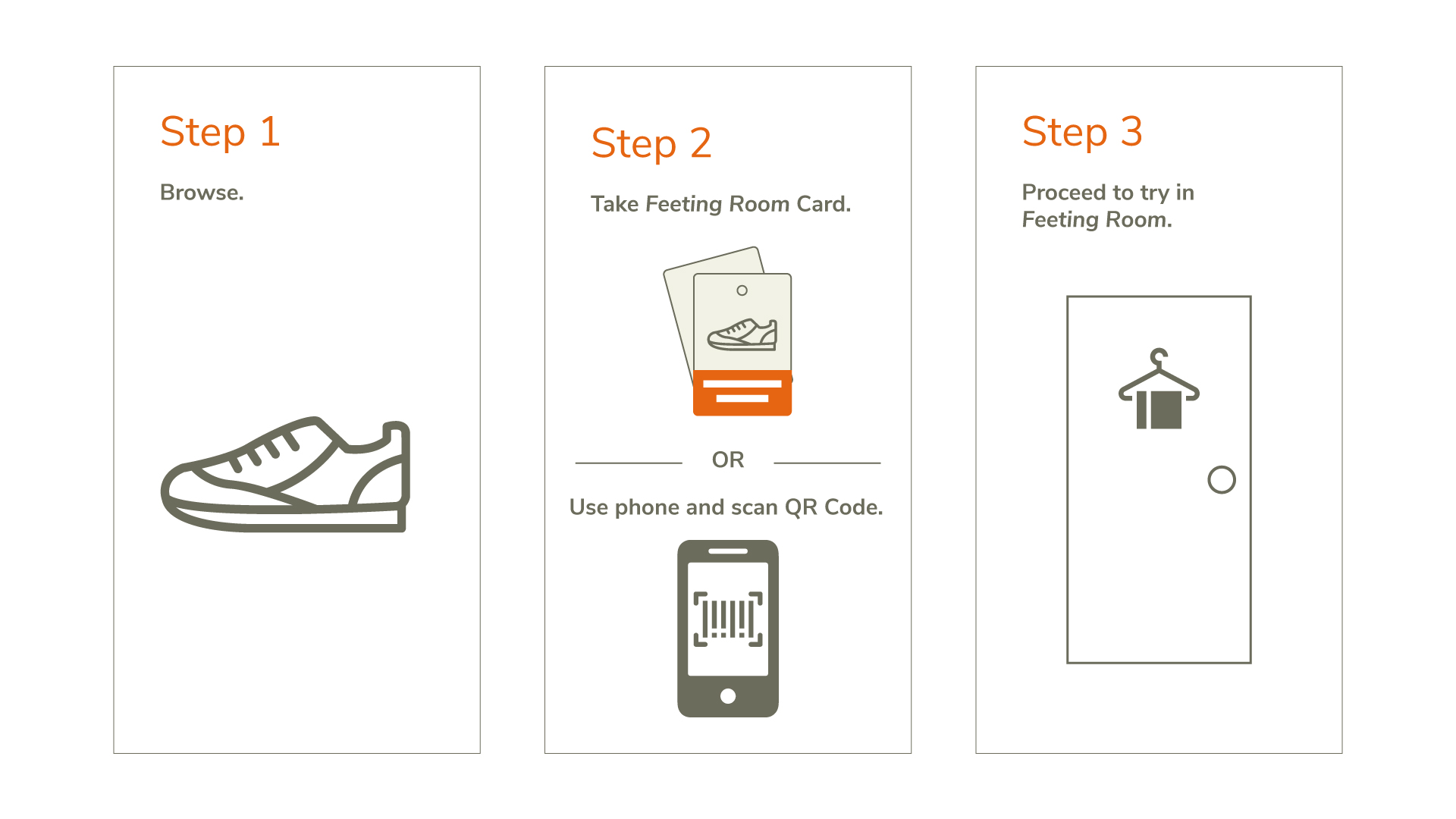
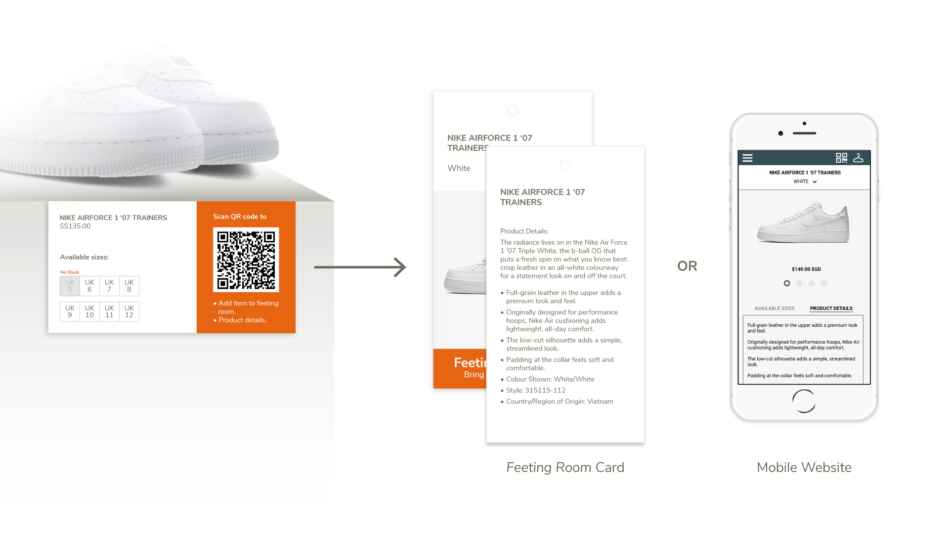
Knowing through browsing
Customers can find product details, such as shoe-size availability and material use on digital signages, Feeting Room card and mobile website.
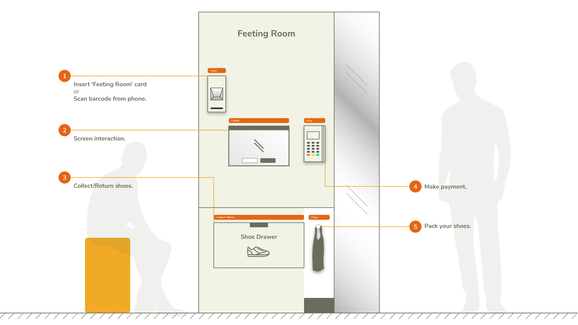
Try at your own time
The Feeting Room provides personal facilities such as available space, seating and mirrors to try on your shoes.
Tests and iterations
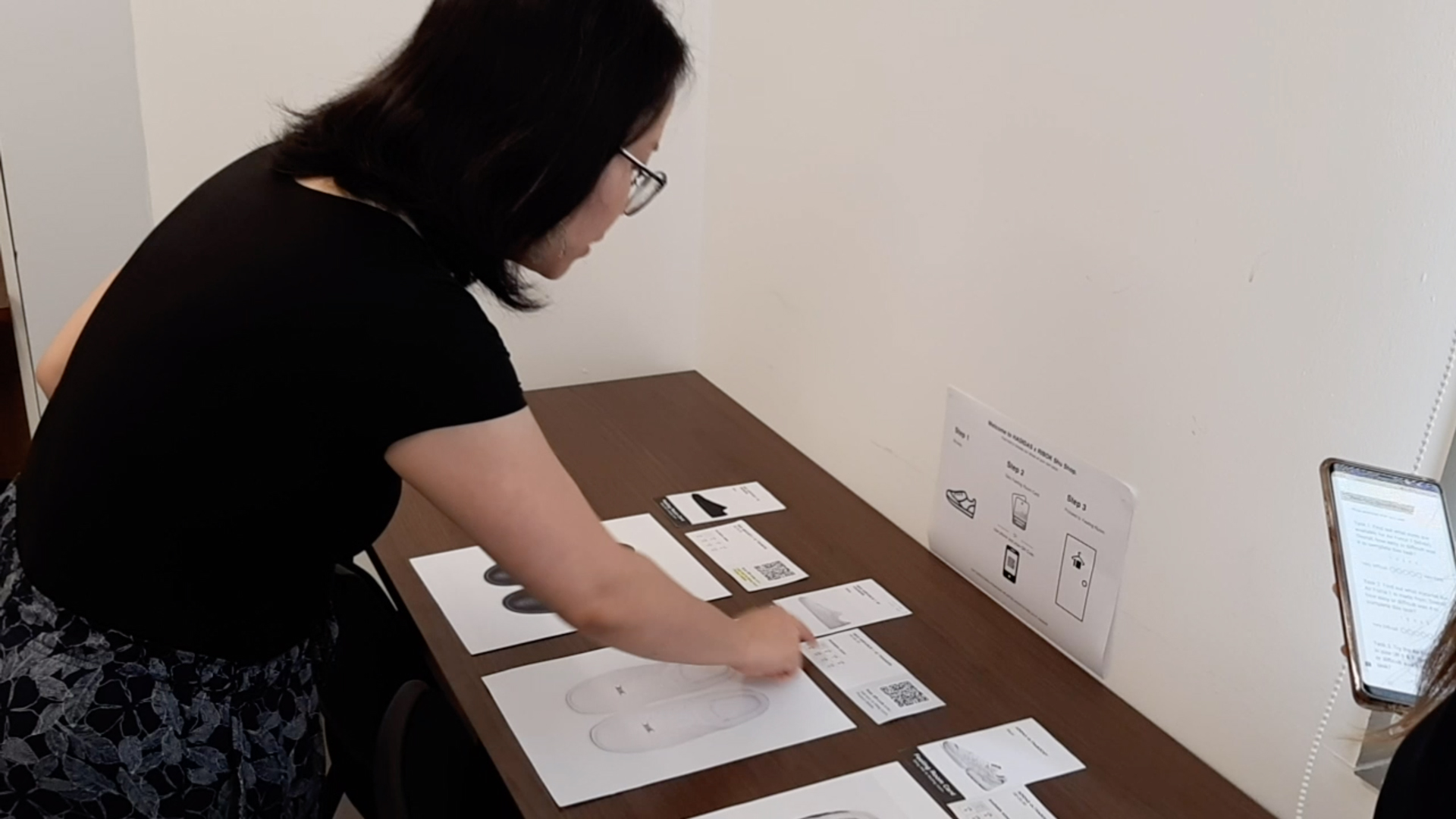
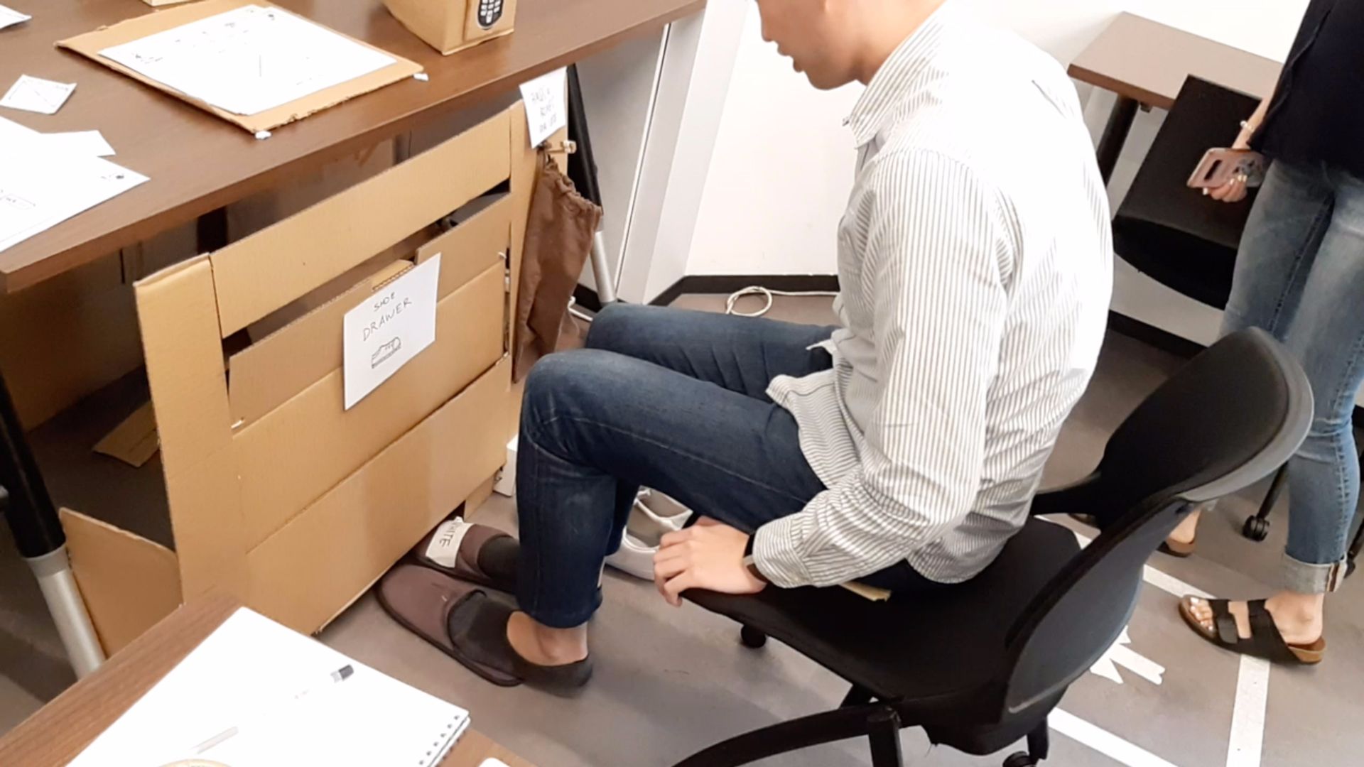
We conducted a usability test on 5 participants with the 1st iteration to test its proof of concept and understand its ease of use in browsing, fitting, checkout and calling for assistance. We applied Net Promoter Score (NPS), Semantic Differential Scale (SDS), Single-Ease Questions (SEQ) and System Usability Scale (SUS) for further quantitative analysis.
Key Issue #1
Uncertain about the steps in using the self-service kiosk.
Iteration
- Shifted the barcode scanner and card slot to the left so that steps are in sequential order, from left to right and top to bottom.
- Steps illustrated by the kiosk parts as a visual aid.
- Include “Pay” and “Pack” steps in the progress bar so that customers know that payment can be done in the Feeting Room kiosk.
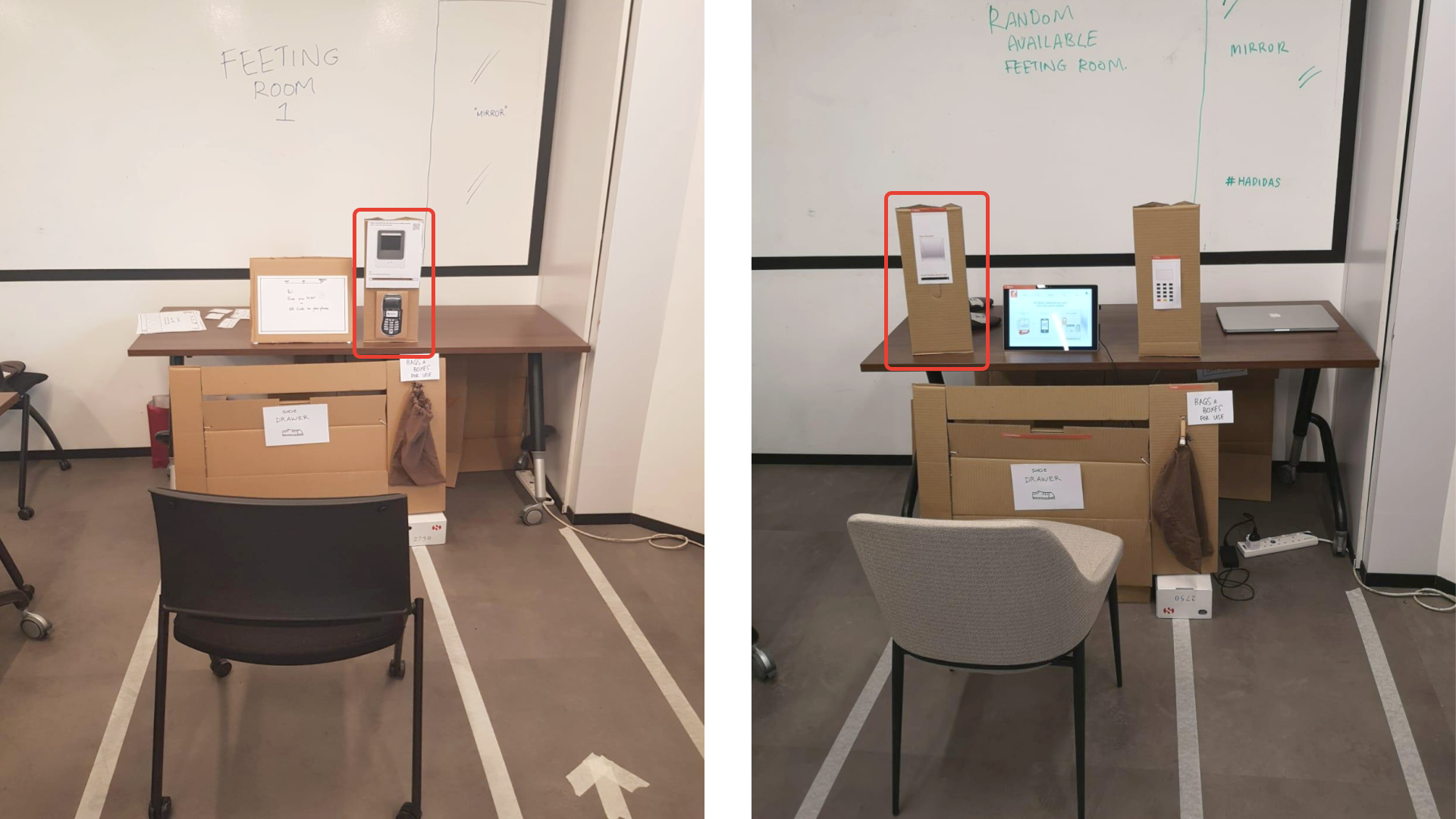
1st iteration prototype (left) and 2nd interation prototype (right).
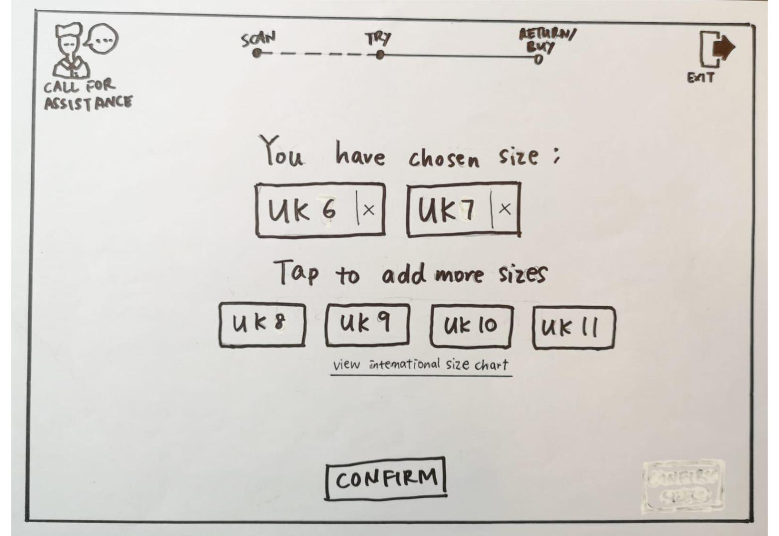
1st iteration prototype, low-fidelity.
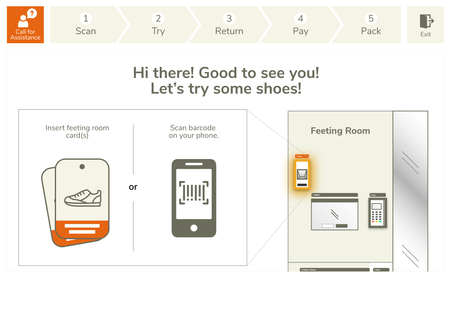
2nd iteration prototype, high-fidelity.
Key Issue #2
Don’t mind self-service kiosk but expect sales assistance around if they need help.
Iteration
- Enhanced the visual affordance of the call for assistance button.
With the findings from the 1st test, we made improvements to the 2nd prototype iteration. For the 2nd test, we increased the tasks difficulties’ as we found the previous tasks to be easy and unrealistic. eg. Customers would try on several shoe designs at the same time instead of one-by-one.
The Outcomes
Space and facilities are suitable
- SDS results showed that customers appreciate the private space to try shoes at their own pace, without feeling pressured to make a decision.
- However, self-service experience still felt transactional.
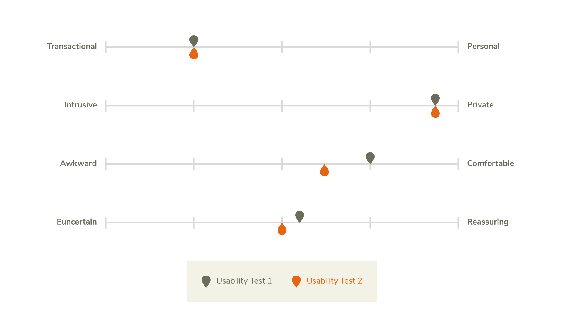
Semantic Differential Scale (SDS) results from 1st and 2nd iteration prototype testings.
Product information are easily found
- SEQ results showed that finding product details on the digital signage, mobile website and Feeting Room card was easy.
- Browsing process with the Feeting Room card was more straightforward and less confusing than the mobile website.
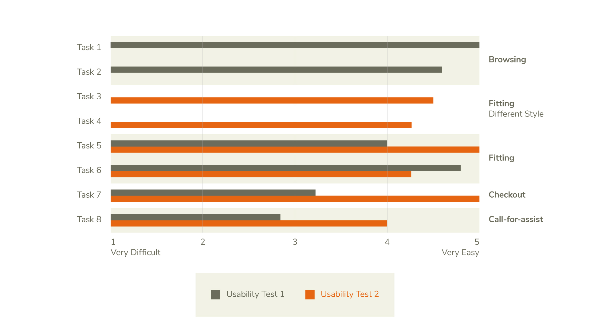
Single Ease Question (SEQ) results from 1st and 2nd iteration prototype testings.
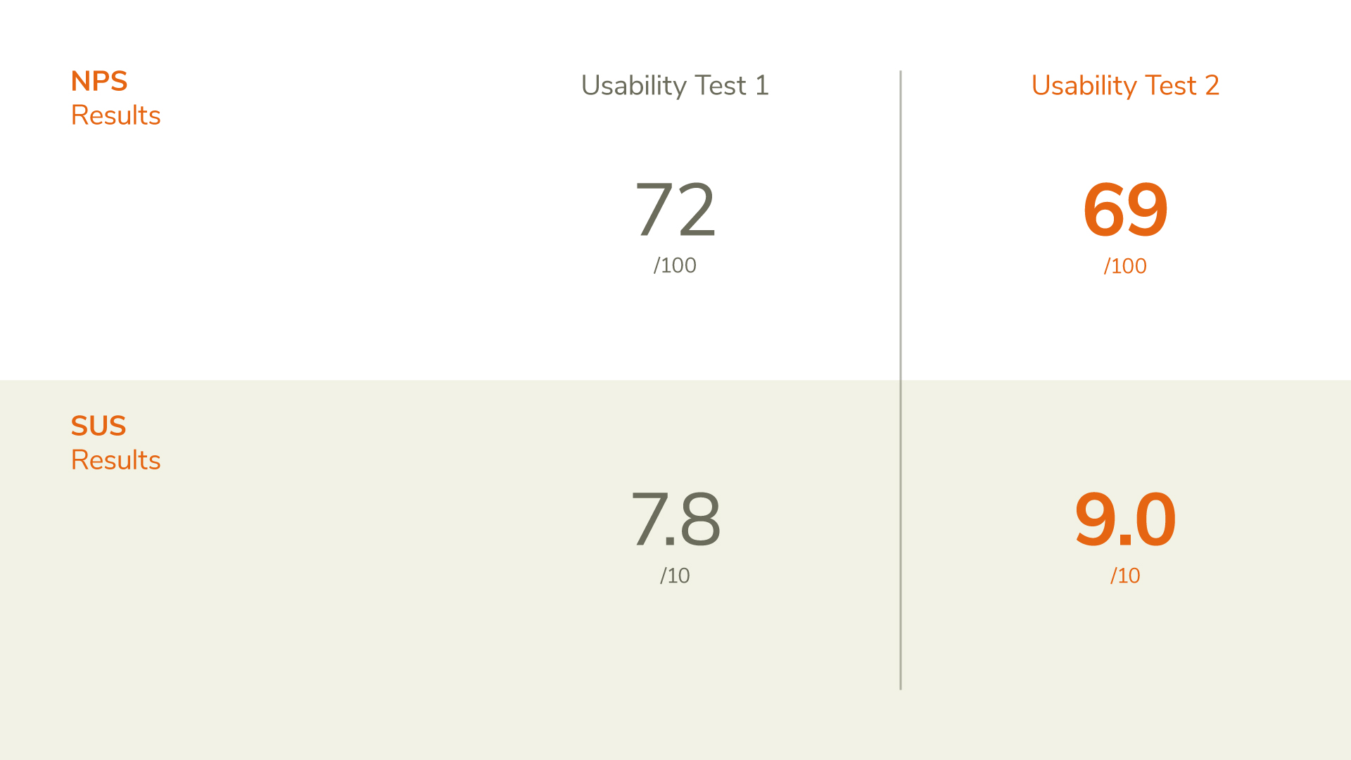
Net Promoter Score (NPS) and System Usability Scale (SUS) results from 1st and 2nd iteration prototype testings.
Concerns over the fitting experience
- SUS and NPS results showed that customers are interested in trying the self-service Feeting Room experience again.
- However, the amount of shoes and additional styles/colours to try on at the Feeting Room is still unclear.
- Shoe condition is also a concern before making purchase.
The Next Steps
1. Further Iterations
- Test Feeting Room card user flow.
- Educate users about user flow for trying additional styles/colours.
- Explore other ways to present the shoes for trying so that it will not be damaged.
2. Shadowing in-store staff
- To understand current SOPs and identify potential issues in implementing our solution.
3. In-store Usability Testing (High-fidelity)
- Test for actual user behavior in a natural setting.
- Understand traffic flow for proposed store layout.
The Lessons
Understanding Business
Working with teammates from different backgrounds allowed me to learn the business factors in service design and new metrics to help support our analysis.