Park Connector Network: Branding
Branding
Summary
I designed a set of branding and wayfinding design guidelines to provide a fresh outlook for our park connectors.
Client
Land Transport Authority
National Parks Board
Urban Redevelopment Authority
Duration
2 Months
My Role
Research
Brand Design
Publication
Tools
Illustrator
InDesign
Photoshop
The Discovery
This project started with an observation made while I was strolling in my neighbourhood.
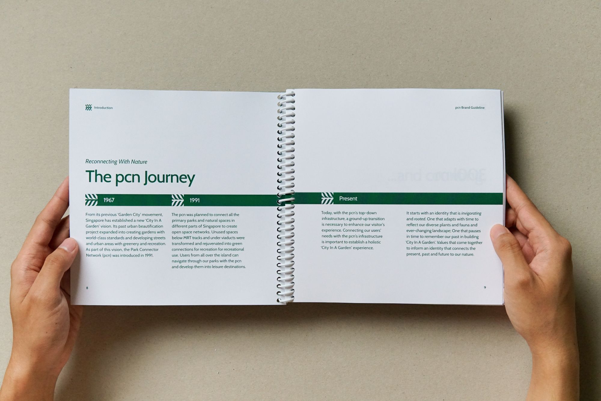
I was intrigued by the signages along the Park Connector Network (pcn). Upon extensive research on the history of pcn and Singapore's 'Garden City' motto, I felt that there was room to rejuvenate its current branding and wayfinding design.
The Development
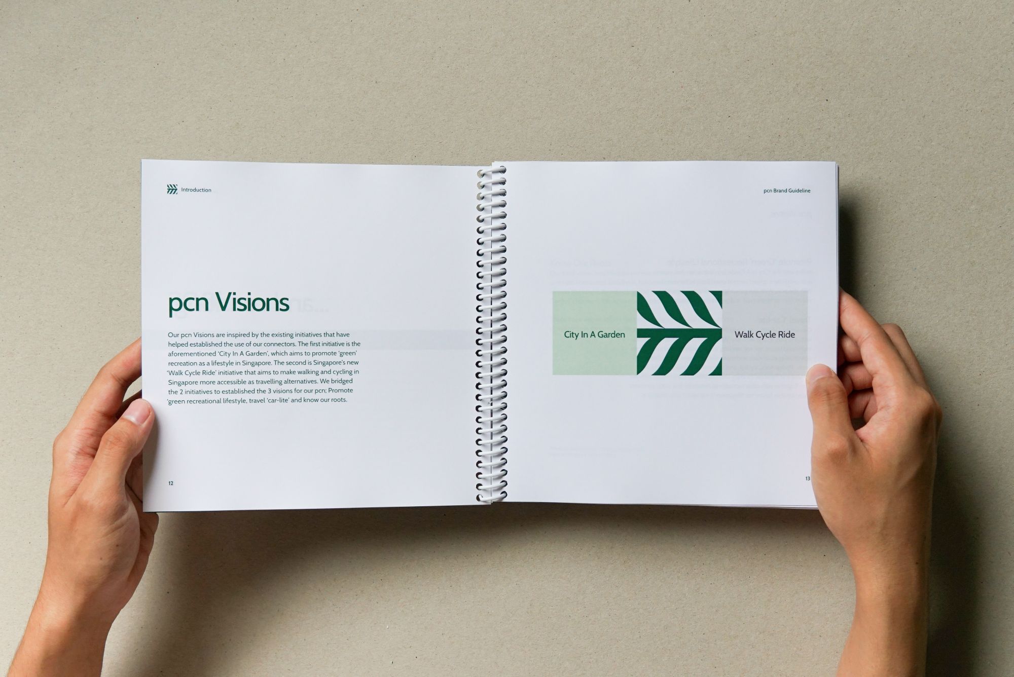
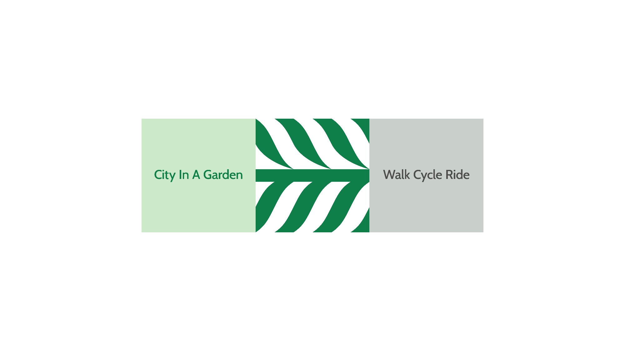
The concept of the project aims to bridge the past, present and future of pcn with Singapore’s existing 'City In A Garden' and 'Walk Cycle Ride' initiative.
Down-to-earth Voice
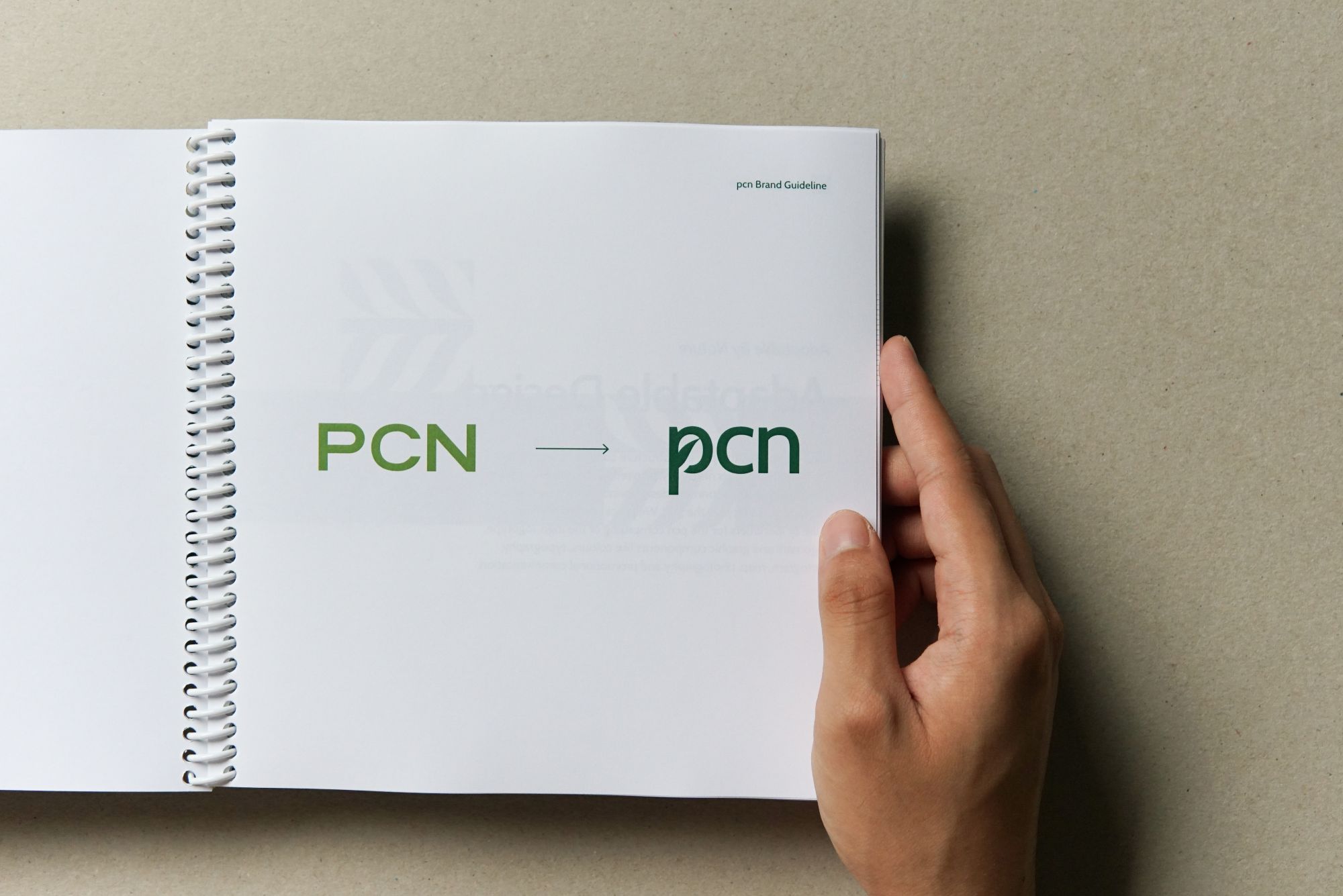
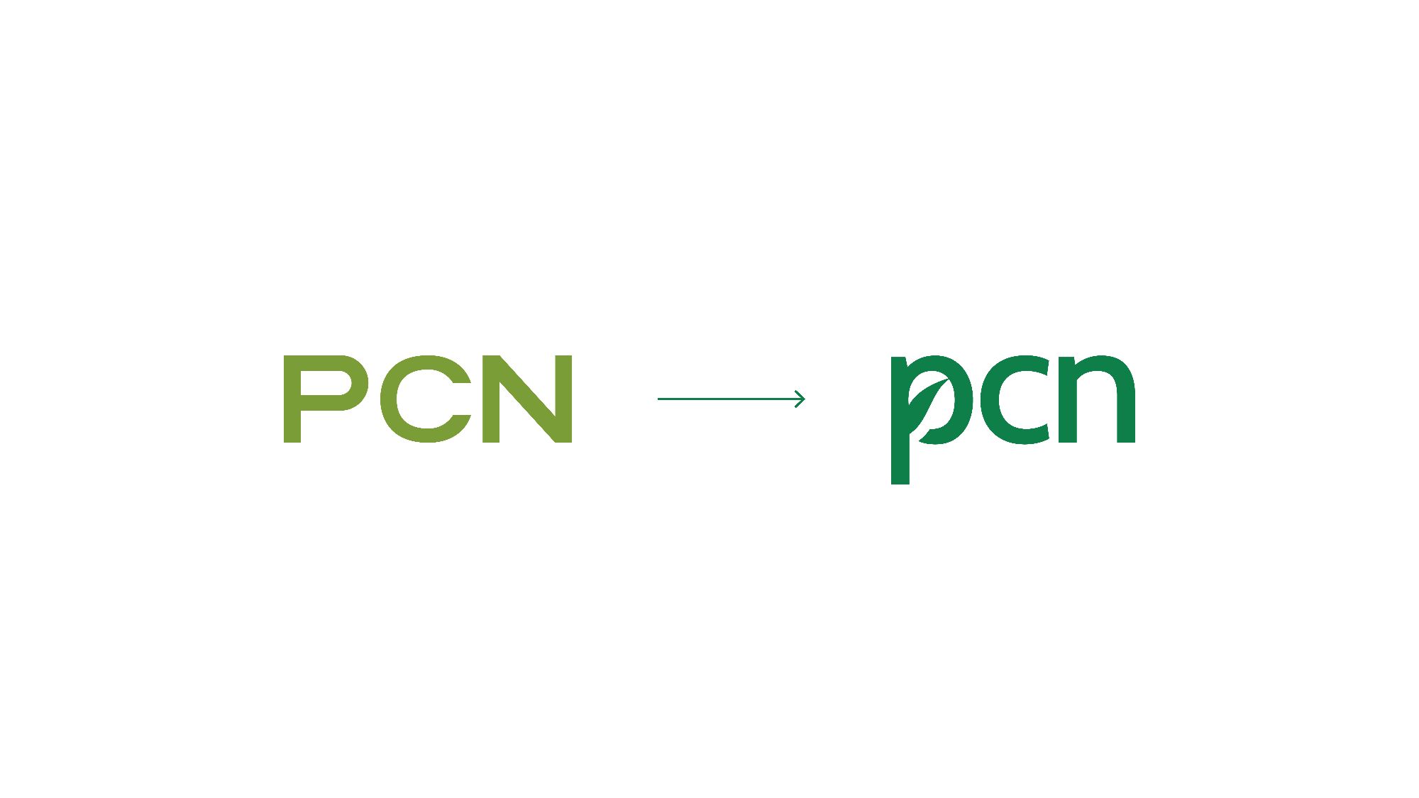
The Park Connector Network is reconnecting with its humble beginnings. To represent this, it starts with its abbreviated name.
Reconnect With Our Roots
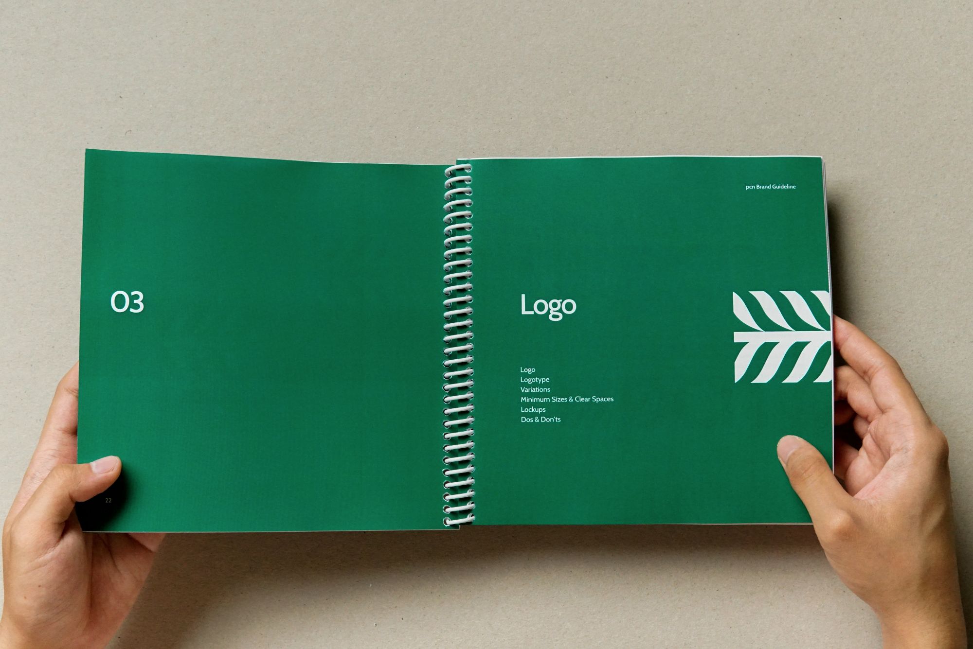
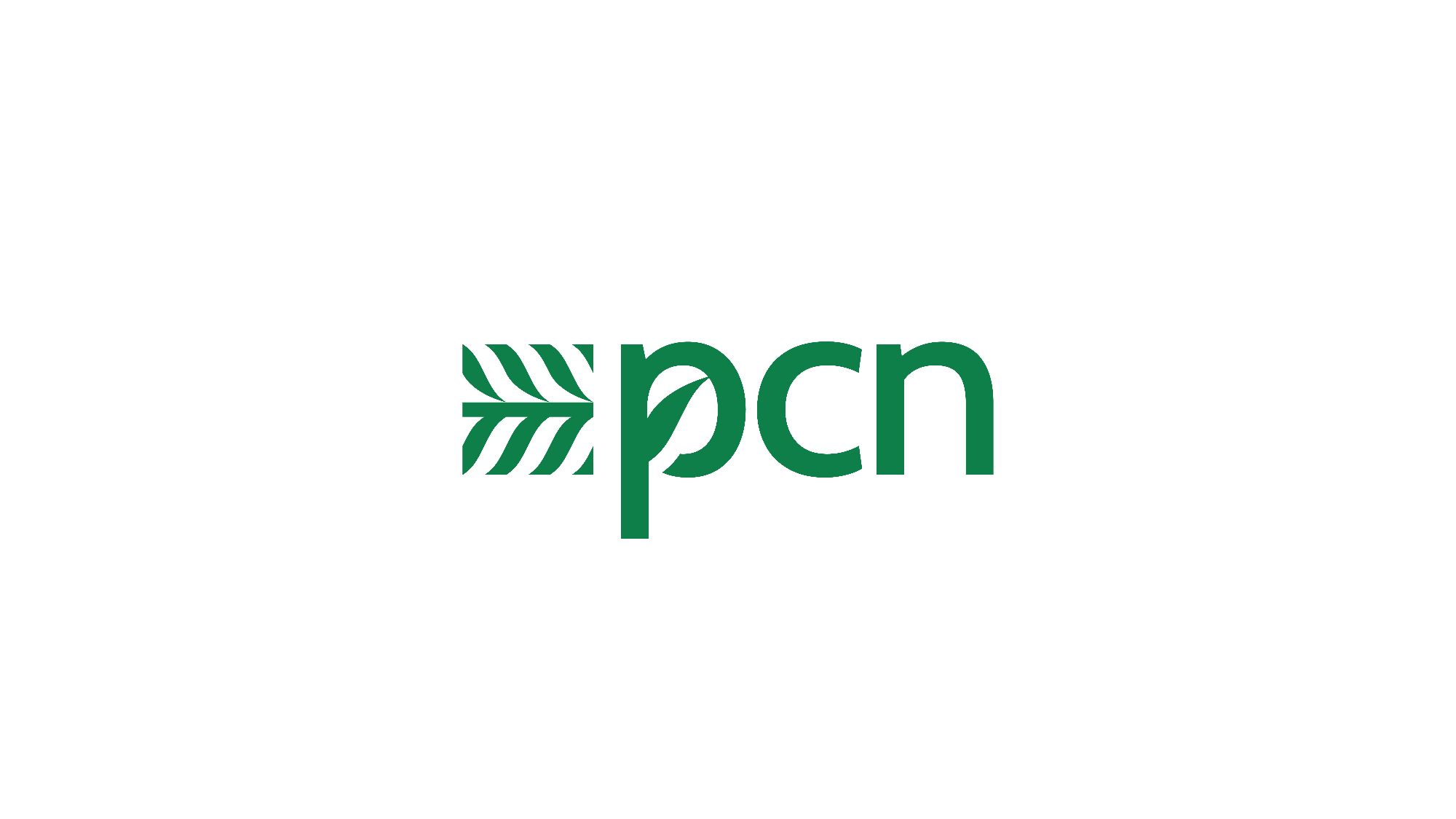
Logotype
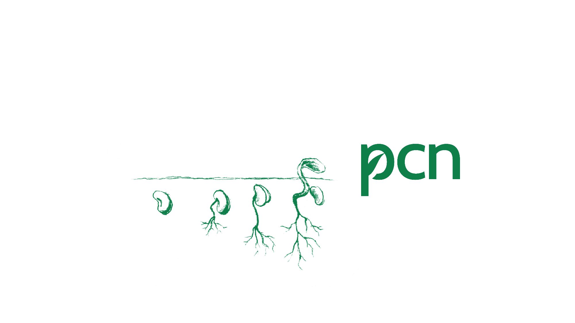
Growing With The Urban
Logomark
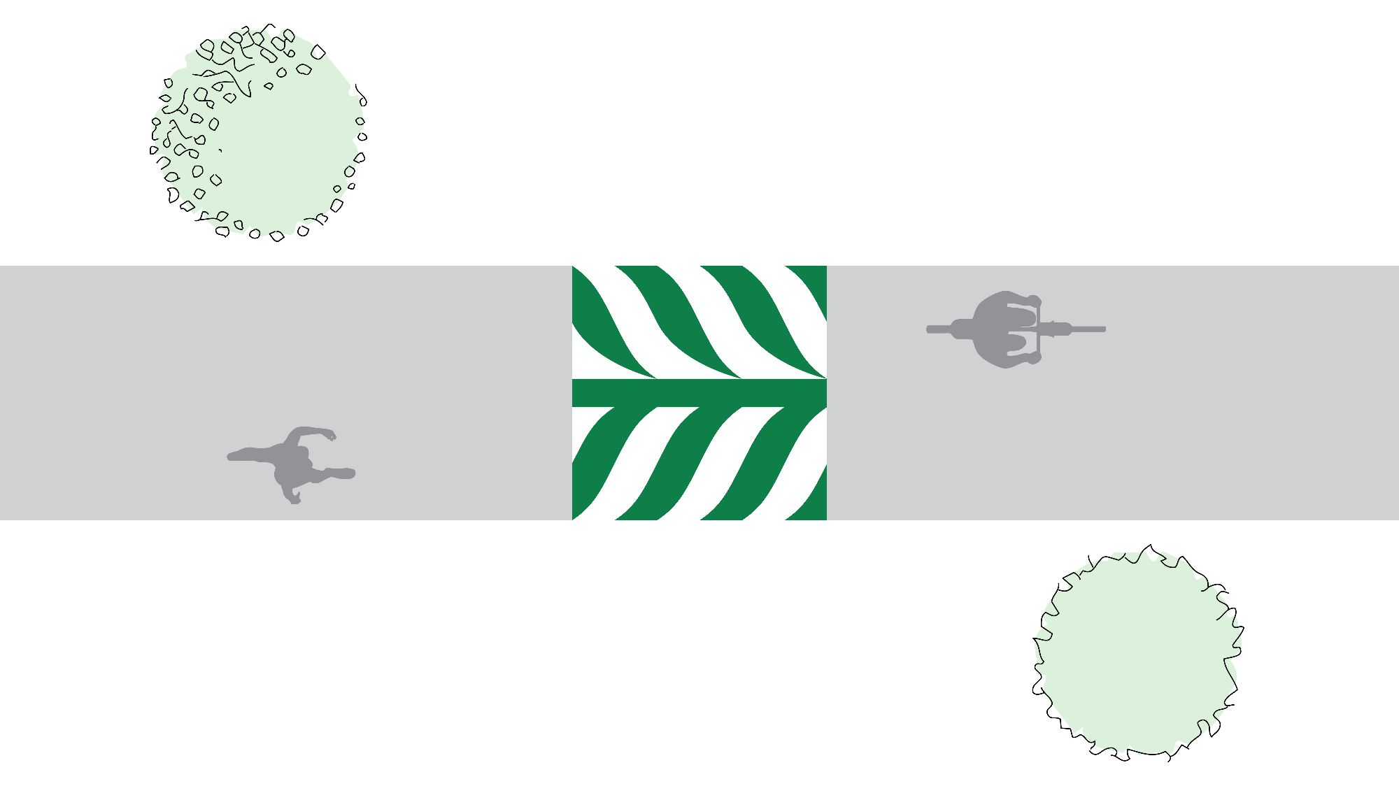
pcn Green
Its brand colour, known as pcn Green, is used to communicate its brand characters as both refreshing and grounded to its roots.

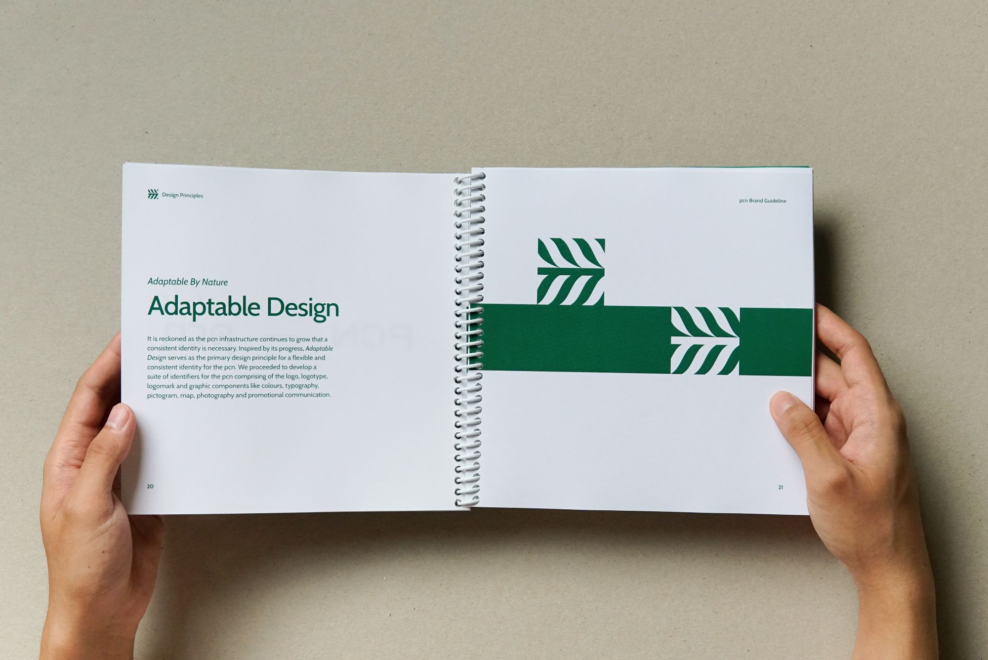
Adaptable Logomark Grid-System
Its values are reflected at the heart of every communication platform. The pcn leaves its mark on an imaginary horizontal path across the centre of the canvas. It is a symbol of transition as we travel on the pcn.

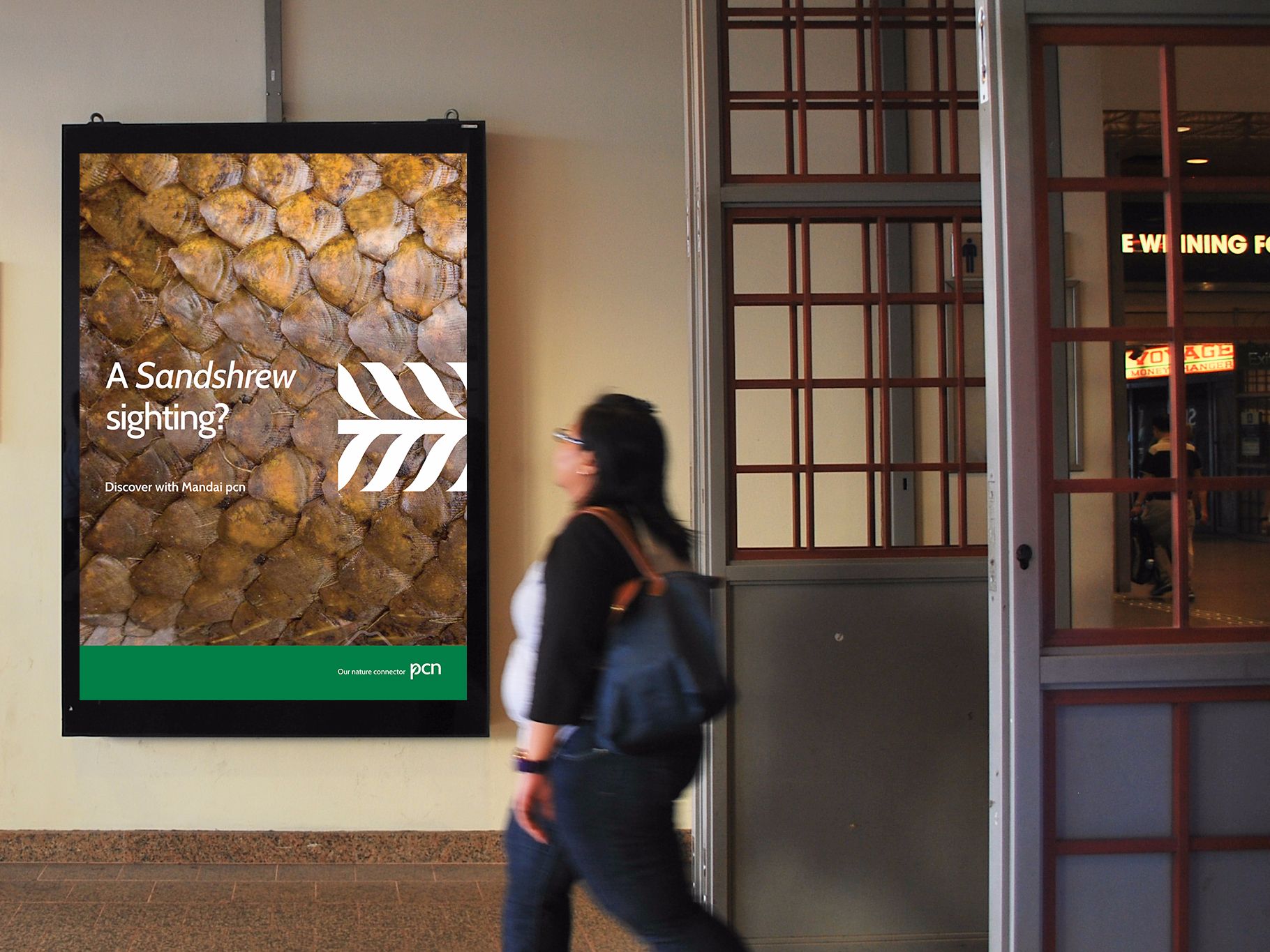
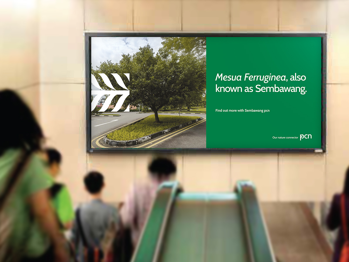
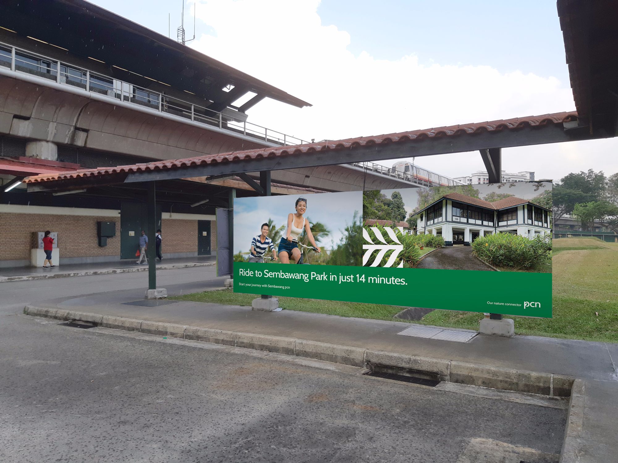
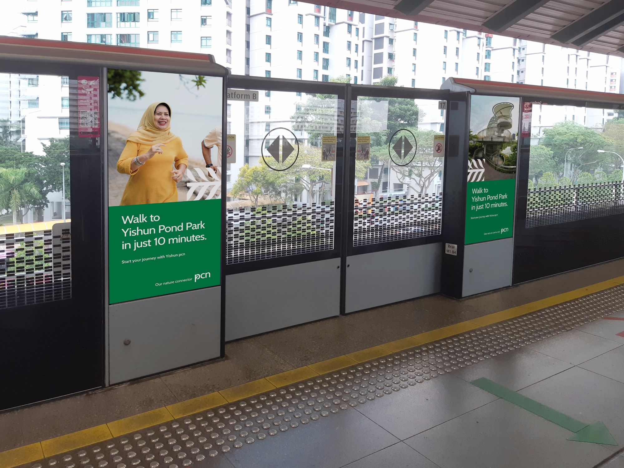
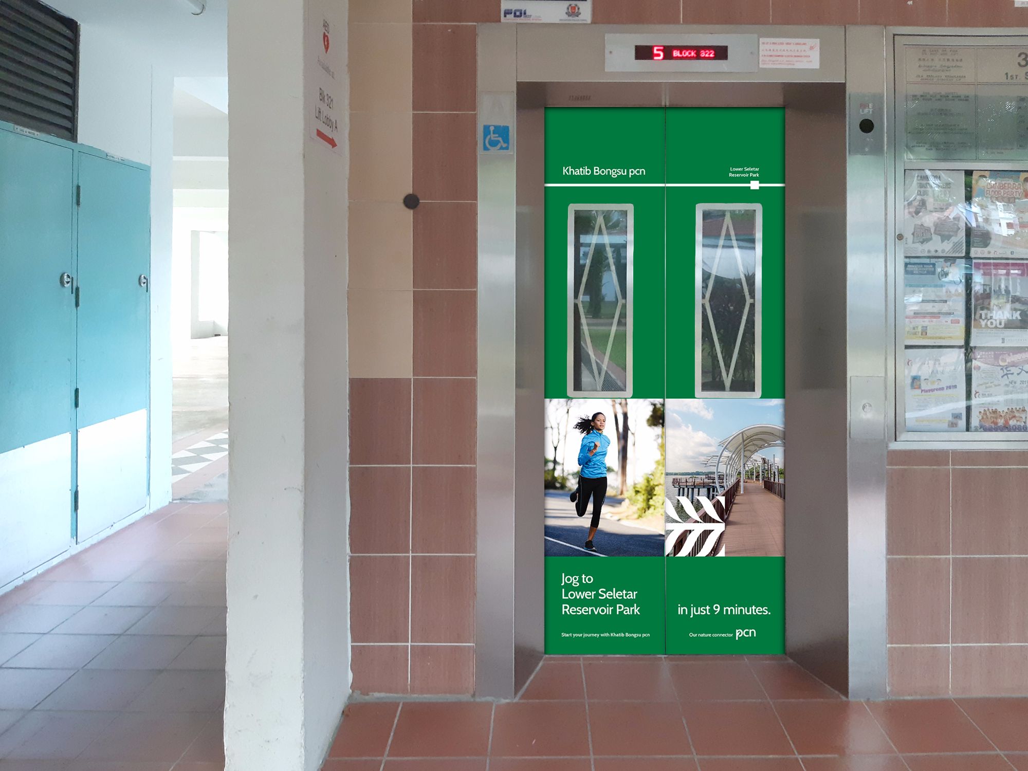
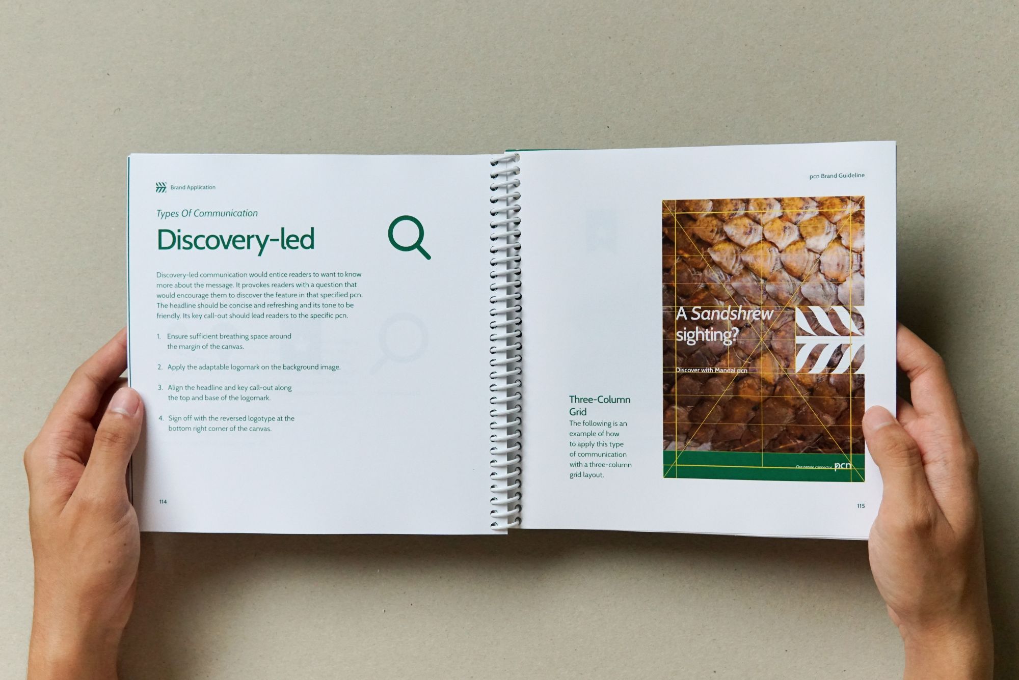
Brand Activation
The brand is activated at the transit junctions of the pcn, such as MRT stations and residential vicinity.