MIMU
App design
Summary
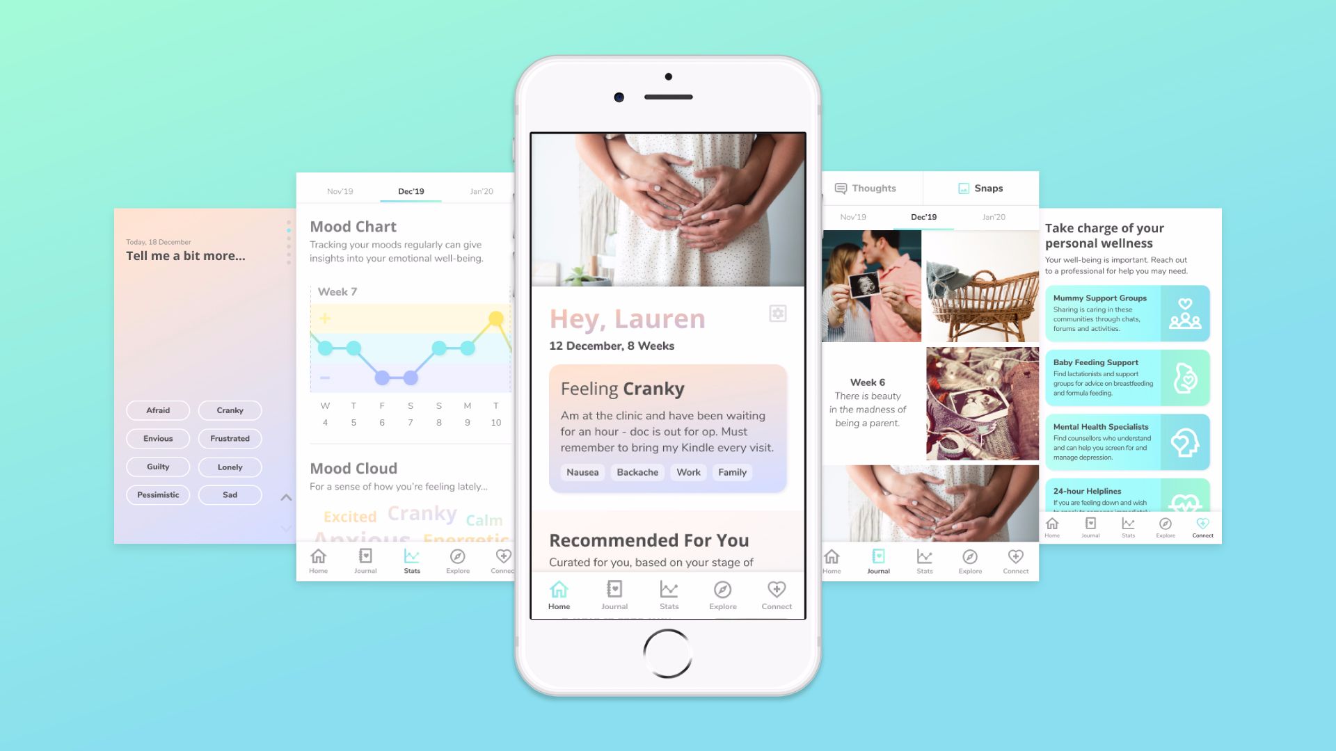
MIMU is a wellness app concept that helps inform, encourage and empower mothers to have a more positive motherhood experience.
Try PrototypeClient
Jamaima
Team
Khor Serene
Terri Lim
Duration
4 Weeks
My Role
User Research
UI Design
User Testing
Tools
Figma
Google Forms
The Challenge
Women’s mental wellbeing and emotions are affected when having a baby, especially during the antenatal and postpartum periods.
We were briefed by a startup company to create a digital friend for mothers to reduce emotional and mental health risks during the antenatal and postpartum periods.

Source: Unsplash
The Discovery
We interviewed 6 women who are pregnant or have had a baby in the past year to understand their emotions, concerns and pain points.
- What are the emotions, concerns and pain points of the antenatal and postnatal journey?
- How do these mothers practice mindfulness?
- How can we develop a wellness app to support these mothers and what features would they find useful?
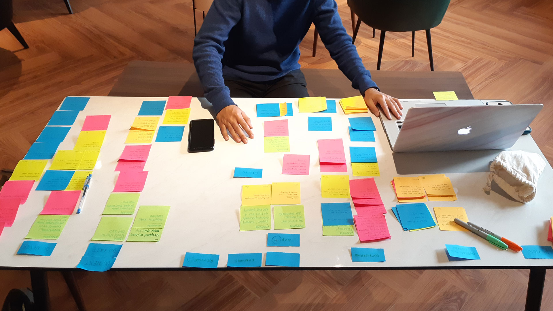
With the findings, we used affinity diagramming and mapped their experience from prenatal to labour and postnatal periods.
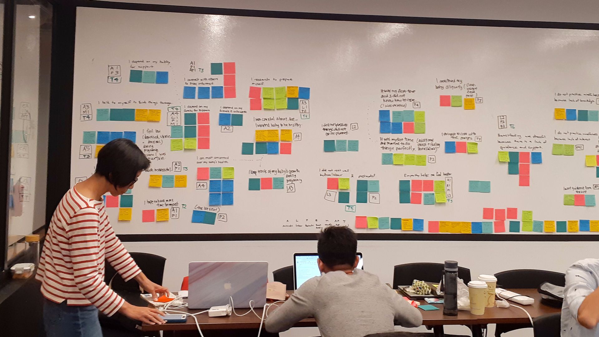
Mothers are more concerned for their baby than themselves.
Although they had negative emotions during their motherhood experience, they still prioritised their baby’s health over themselves.
They don’t practice mindfulness.
Although some are aware of mindfulness, none of them practice it.
They research heavily for their baby and not themselves.
Mothers are resourceful in searching for solutions for their baby.
We were overwhelmed by the vast findings of the antenatal, labour and postnatal experiences. Due to time constraint, we had to narrow our priorities for this project. A study from Singhealth showed that antenatal depression is more common than postnatal depression. We hypothesised that developing a wellness solution for mothers during the first trimester would raise their awareness through their motherhood experience.
The Definition
Following our findings, we created a persona to help us focus on the pregnant woman’s ideal goals and challenges.

Problem Statement
Lauren needs a way to have a more positive motherhood experience but lacks the understanding of how taking care of her personal well-being can help.
The Development
With our findings, we identified 3 themes to guide us through our development process.
1. Inform
How might we inform Lauren on the importance of taking care of herself during and after pregnancy?
2. Encourage
How might we encourage Lauren through the pre and postnatal journey?
3. Empower
How might we empower Lauren to have a more positive motherhood experience?
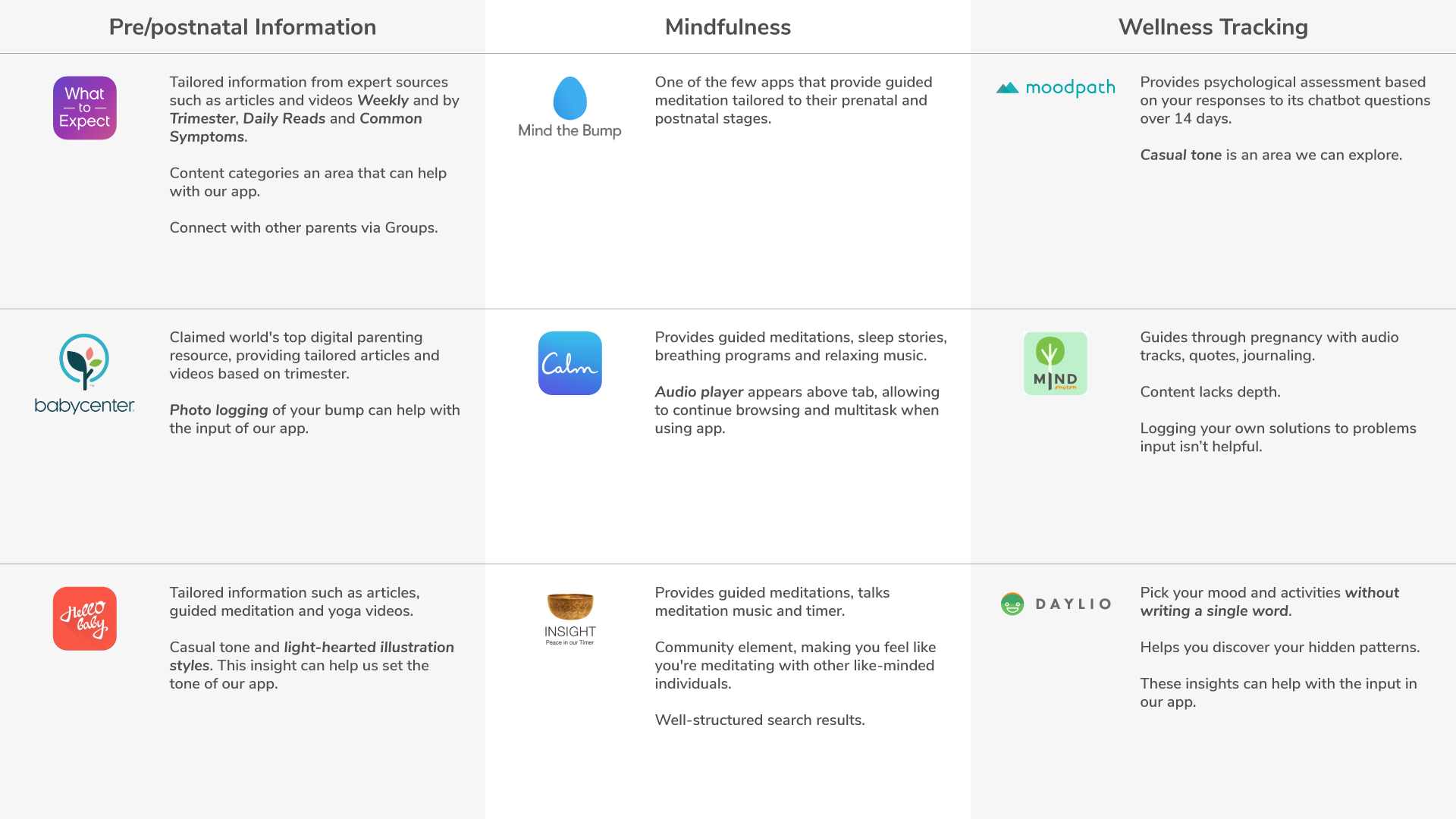
We conducted a comparative analysis to understand the solutions available in the market that Lauren would ideally need.
Based on our findings, we identified a gap in the market where there’s no comprehensive solution for Lauren. We referenced the key features found in our app analysis to create our MIMU app.
Creating the calm tone.
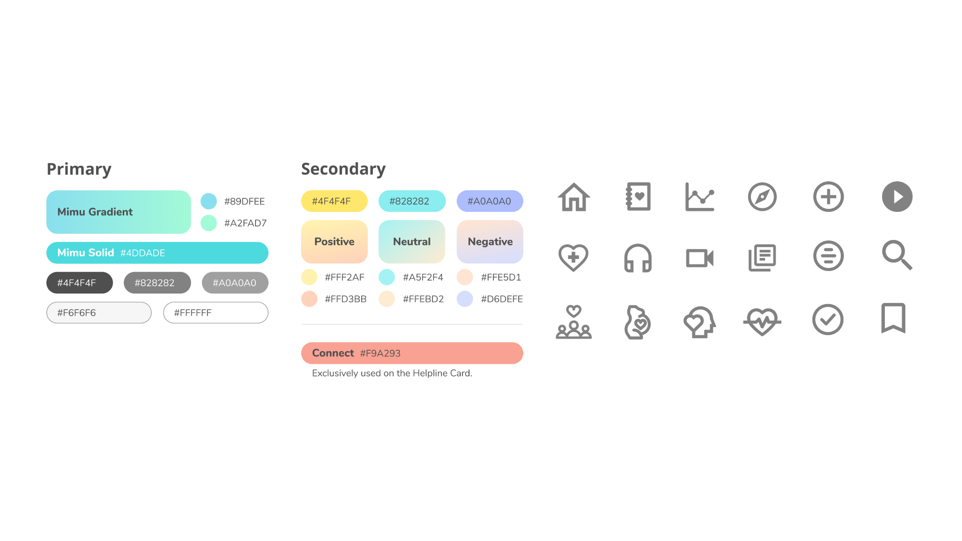
We hypothesised that a calm tone would be a visual cue for mothers to have a more positive experience when using the app. From our interview insights, they associate calming colours in pastel tones of purple, blue, teal and green. With these findings and the colours of the apps from our comparative analysis, we created a design guideline to ensure consistency through our prototyping process.
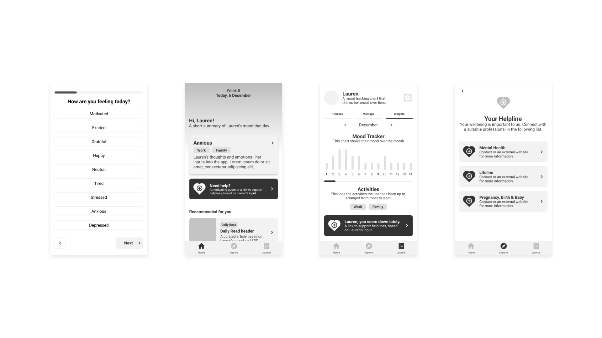
Wireframing
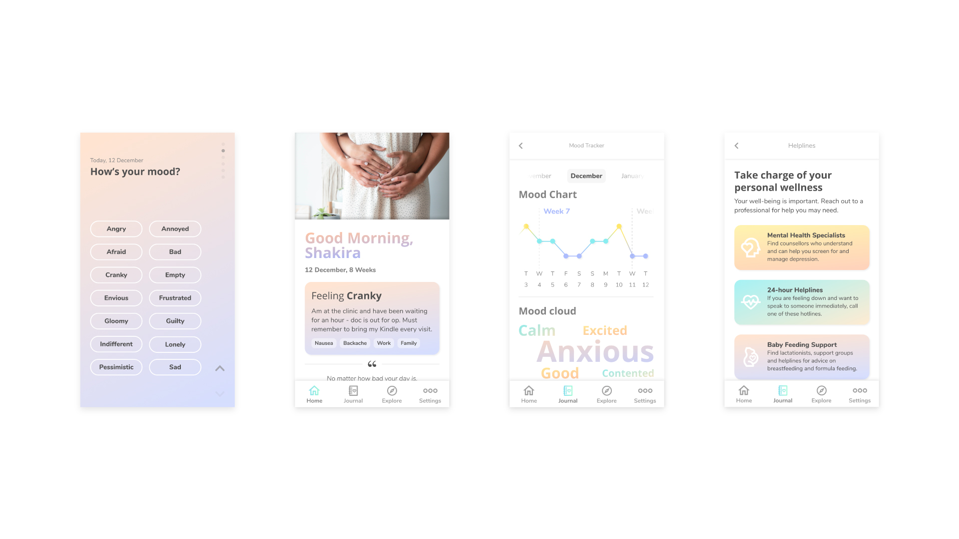
1st iteration prototype
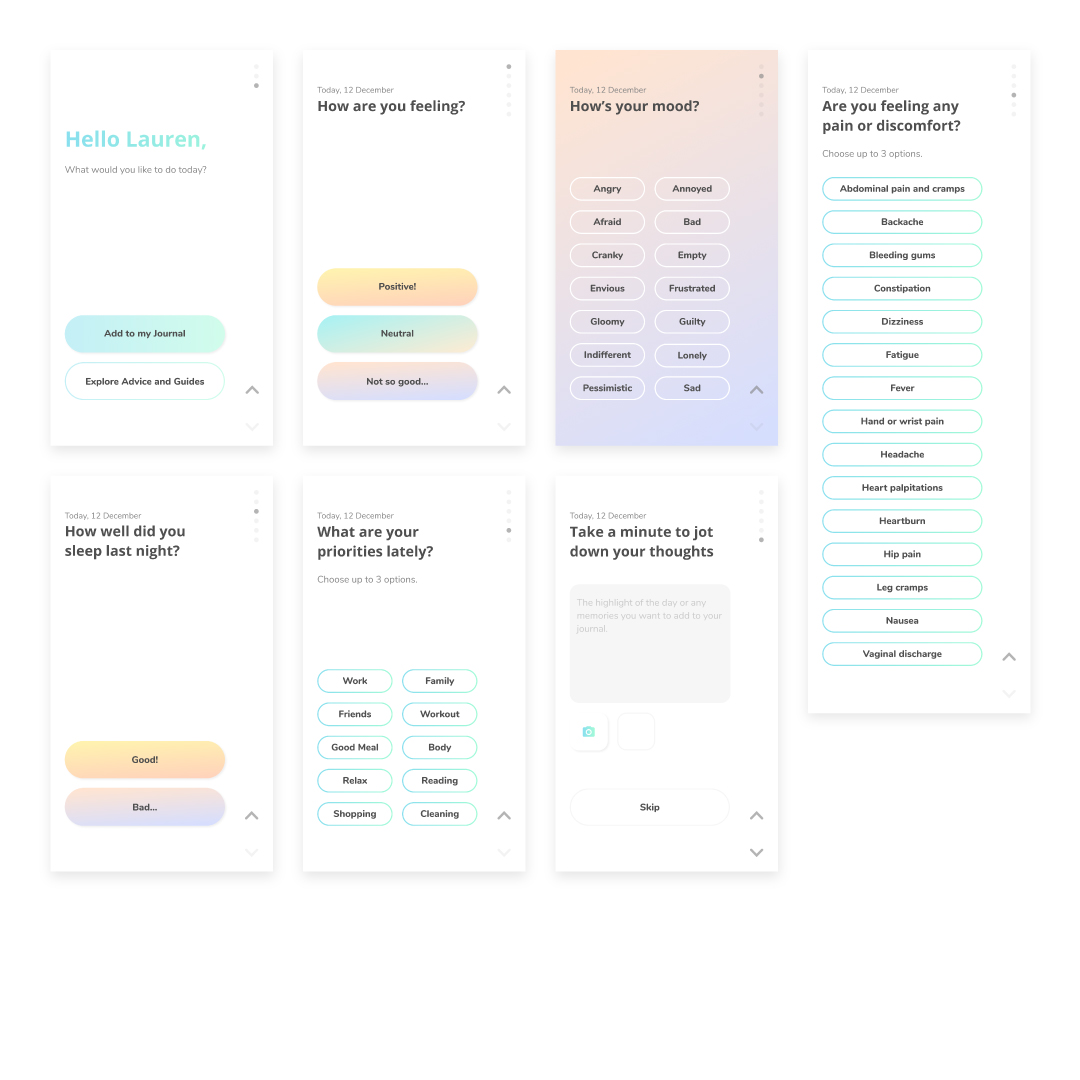
Tracker to tailor content
The app encourages Lauren to key in entries daily, such as:
- Mood
- Sleep Wellness
- Symptoms
- Priorities
- Reflections
The information would help customise the content in the app to guide her through her challenges in a more positive manner.
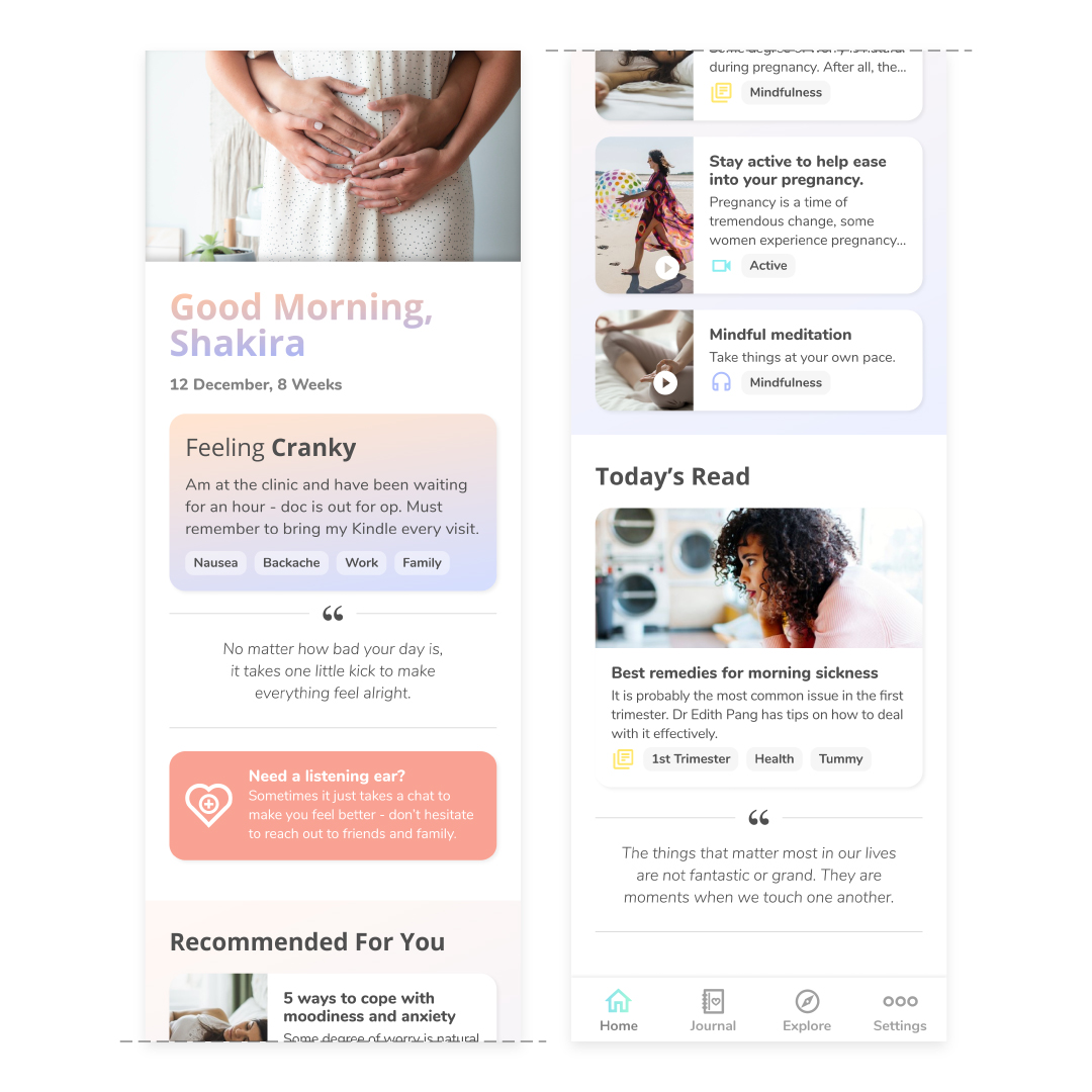
Tailored content to inform
Directly from the homepage, she can find content tailored for her such as:
- Articles
- Videos
- Podcasts
- Quotes
Lauren also has the flexibility to search for other wellness topics in the Explore tab.
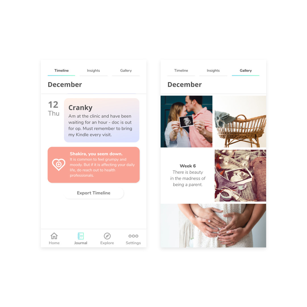
Journaling to reflect
Lauren can be reminded of her beautiful memories through her pregnancy journey by:
- Logging her thoughts
- Uploading photos
These inputs will be collated into the Journal tab.
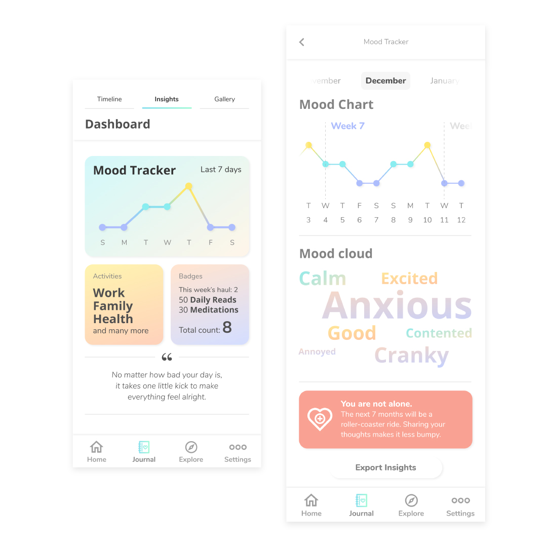
Encourage with stats
The Stats screen is a log of Lauren’s moods, priorities and accessed content. Her inputs are categorised and displayed into:
- Mood Chart
- Mood Cloud
- Activities
- Badges
She can earn badges to motivate her to read, watch and listen. She can customise and download the information she wants into a pdf journal.
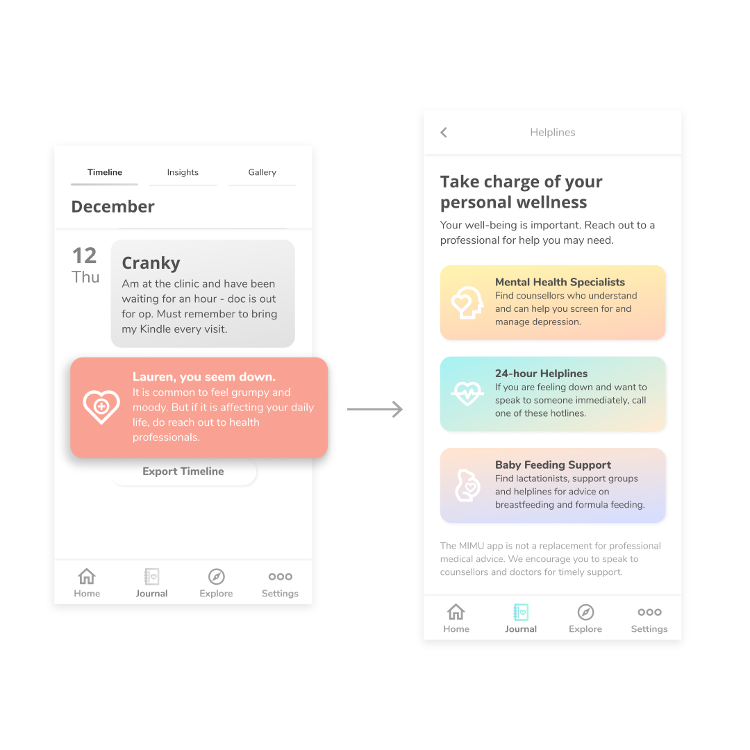
Empower through helpline
Lauren is able to reach out to healthcare professionals when she needs to cope with issues like depression, anxiety and breastfeeding difficulties. The app will track if she needs professional help. The helpline button will be found on any screens.
Tests and iterations
We conducted a usability test on 5 participants with the 1st iteration to gain insights into its proof of concept, their impression of the look and feel and the feedback on features and information. We applied Semantic Differential Scale (SDS) for further quantitative analysis.
As the 1st test findings were vast, we prioritised the issues through affinity diagramming. With the prioritised findings, we made improvements to the 2nd prototype iteration.
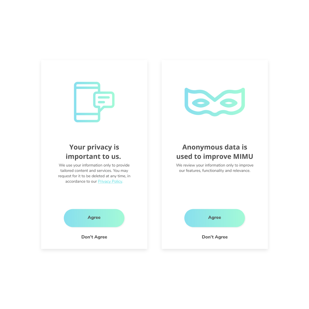
2nd iteration.
Key Issues – Onboarding
- Privacy is a concern with personal data keyed in.
Iteration
- Added privacy protection info to reassure readers, and for AI functions, if needed.
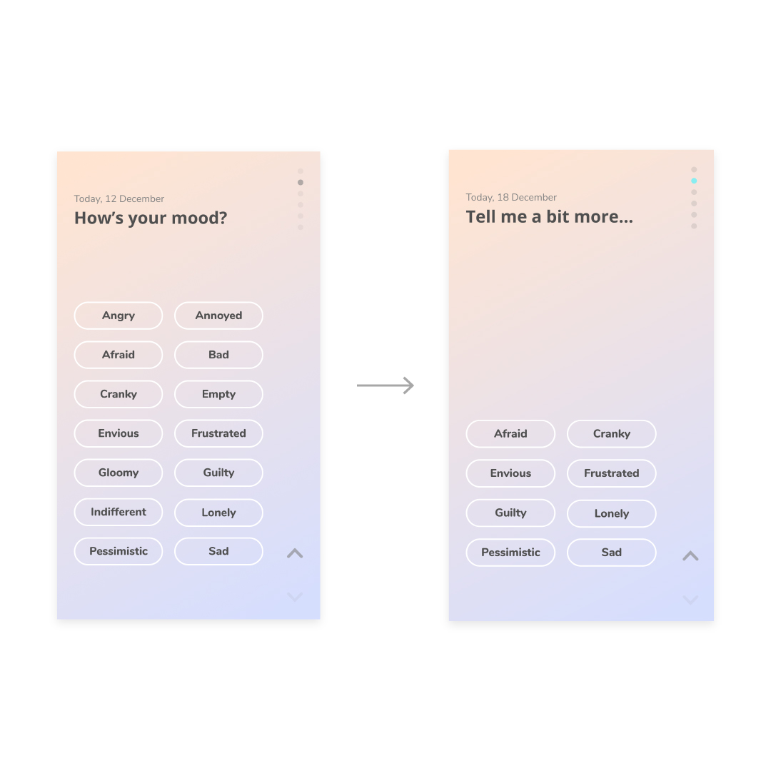
1st iteration (left), 2nd iteration (right).
Key Issues – Input
- Some mood descriptors are similar.
Iteration
- Streamlined the mood descriptors.
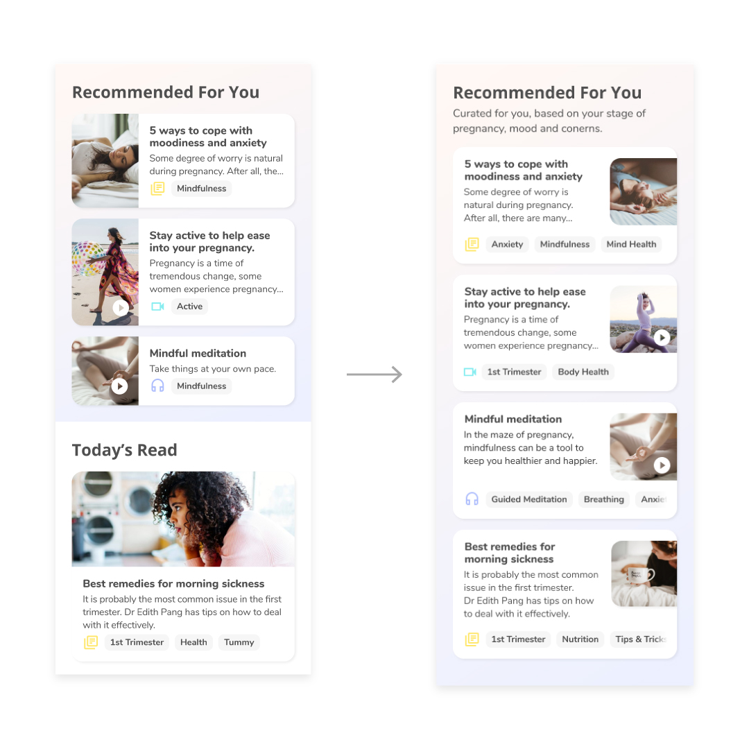
1st iteration (left), 2nd iteration (right).
Key Issues – Home Screen
- Unsure if Today’s Read is the focus article as it has a bigger photo.
Iteration
- Revised the layout to reflect equal focus on the content.
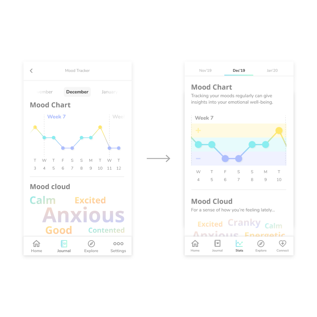
1st iteration (left), 2nd iteration (right).
Key Issues – Journal
- Unsure where their inputs went.
- Want to click mood chart date to see that day’s entry.
Iteration
- Separate Stats into a tab from Journal tab. Gallery and Insights features in Journal tab are renamed to Thoughts and Snaps.
- Made the points on the chart clickable.
1st iteration (left), 2nd iteration (right).
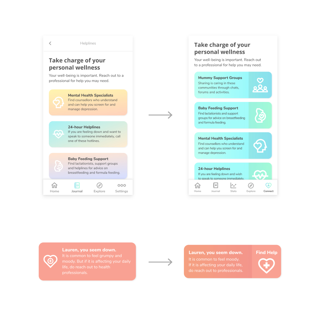
Key Issues – Helpline
- Unsure where to find Helpline information.
- Would like to connect with other pregnant mothers.
- Cards didn’t appear to be clickable.
Iteration
- Added a Connect tab to the navigation bar to access support resources - support groups and healthcare experts.
- Revised the look of the clickable cards.
The Outcomes
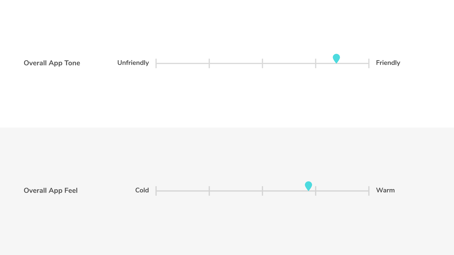
Semantic Differential Scale (SDS) result from 1st iteration prototype testing.
MIMU is warm and friendly.
- The tone throughout the app is friendly.
- Despite the cool colours, users still feel the warmth (calming, inviting, peaceful, sweet).
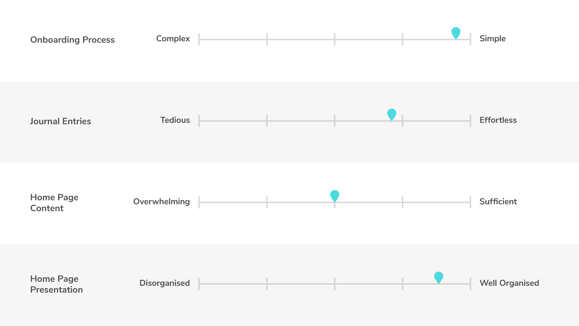
Semantic Differential Scale (SDS) result from 1st iteration prototype testing.
Easy tracking, easily informed.
- The onboarding process was simple and keying in journal entries was fairly effortless.
- The home screen content is sufficient and well organised.
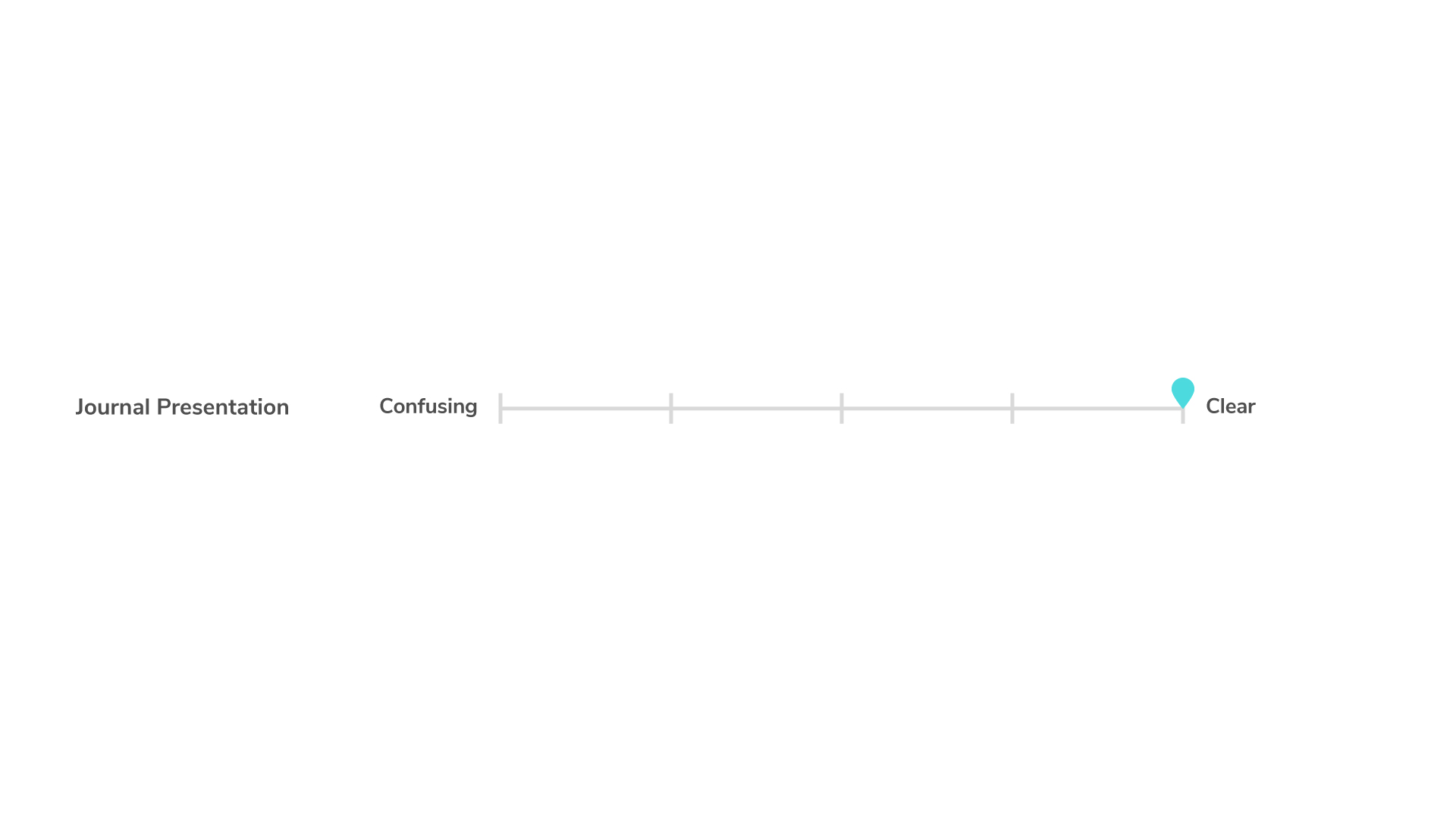
Semantic Differential Scale (SDS) result from 1st iteration prototype testing.
Journaling is still confusing despite its clear presentation.
- Although information is clear, some participants were confused with the placement of the statistics and the functions of the buttons.
Connect with more to empower.
- Other than seeking professional help, they would also like to reach out to mummy support groups to connect with other pregnant mothers.
With these findings, we developed the 2nd iteration prototype of MIMU app.
Try Prototype

The Next Steps
1. Further Testing
- Conduct 2nd usability test.
2. User Input
- Understand the key factors required for wellness tracking from a practitioner.
- Different set of input questions at different frequencies (eg. daily, weekly etc.).
3. Reminders
- Notifications to remind users to log their moods.
The Lessons
Prioritising on our capabilities.
We spent quite a lot of time figuring out the right set of questions for the app input. Although we took references for these questions from other apps in the market, we realise that we derive our decisions based on instinct. It’s more ideal to be working with a professional to identify the right inputs to track wellness. This in turn affected our time and productivity. Through this process, we learned to prioritise our work based on our capabilities.